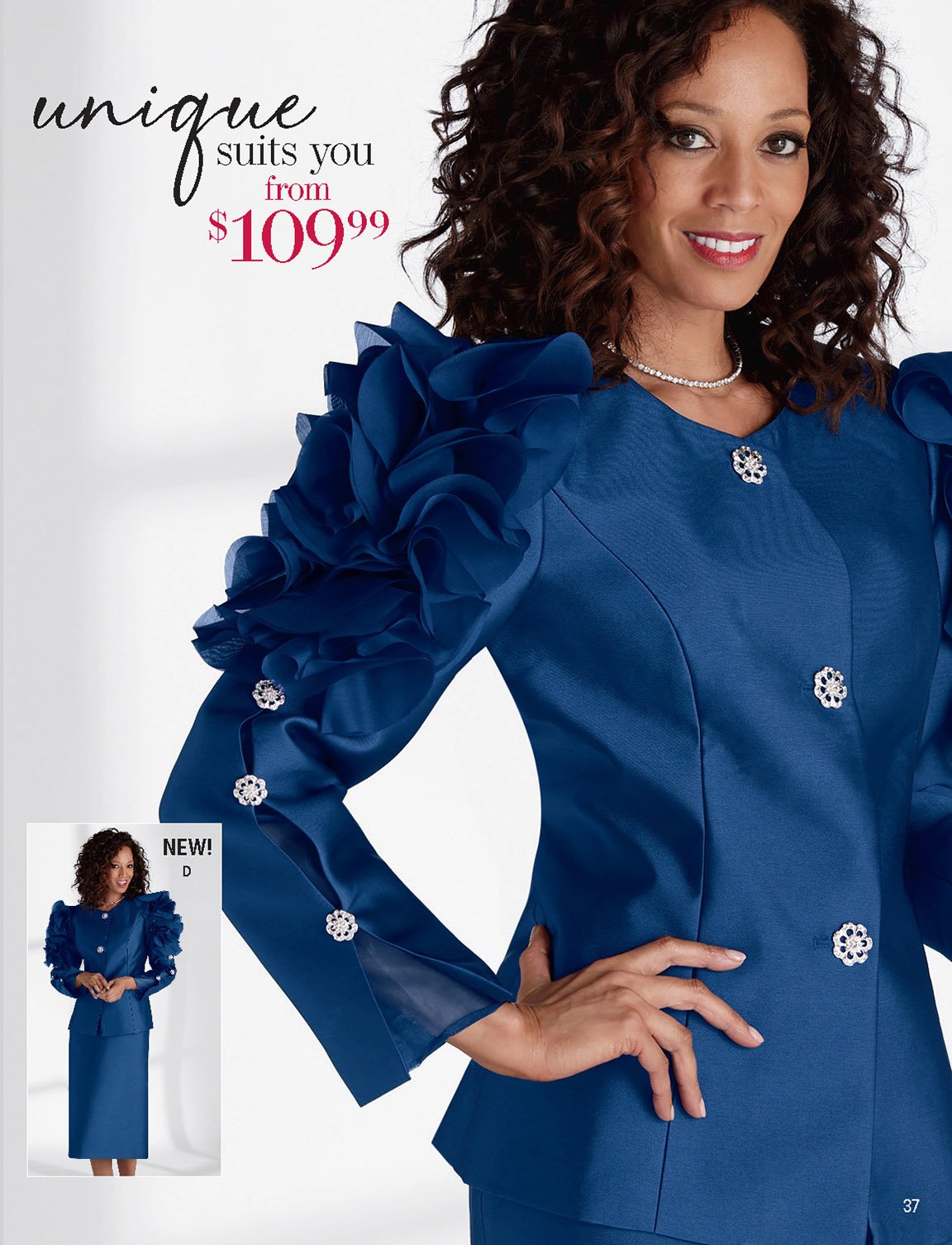
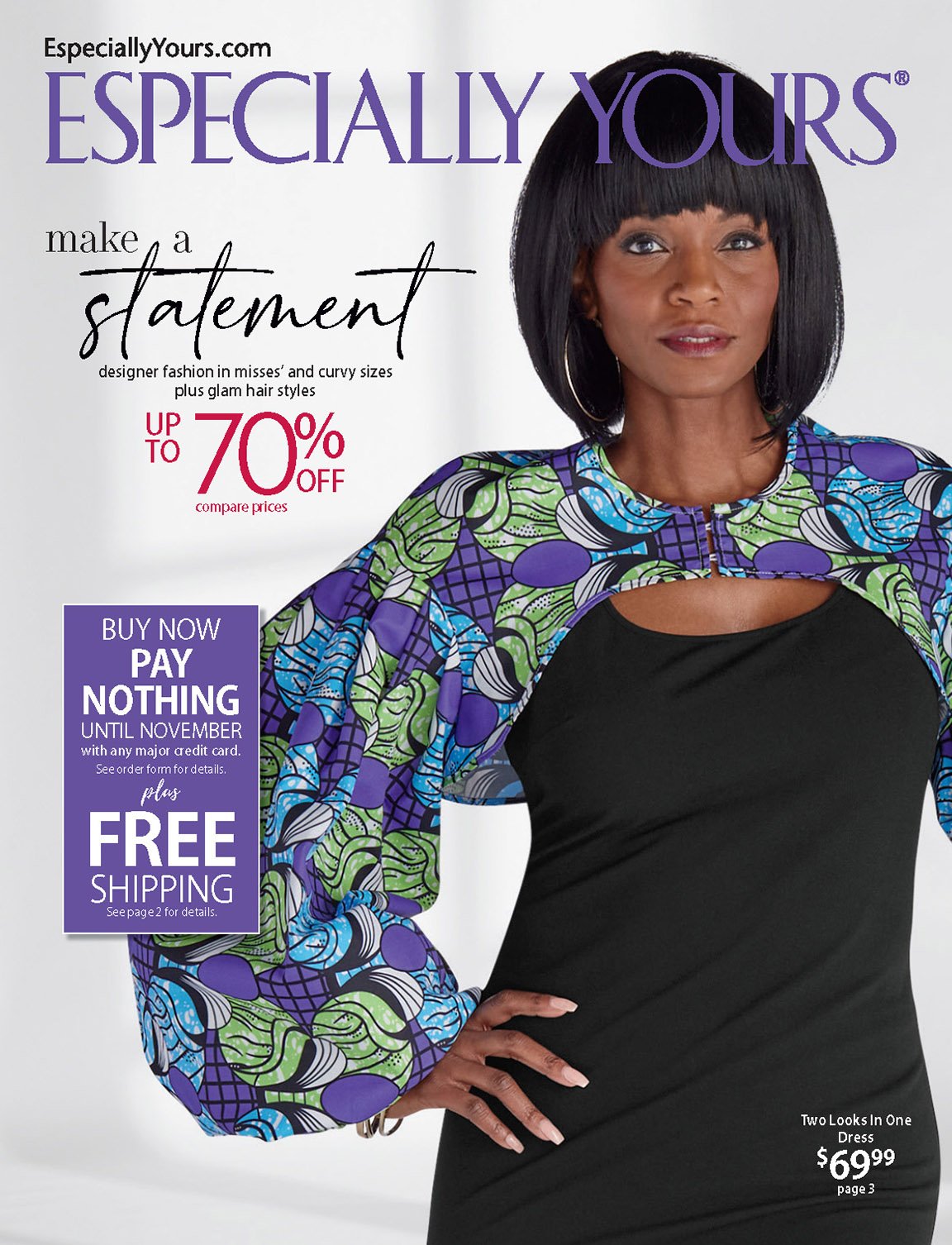
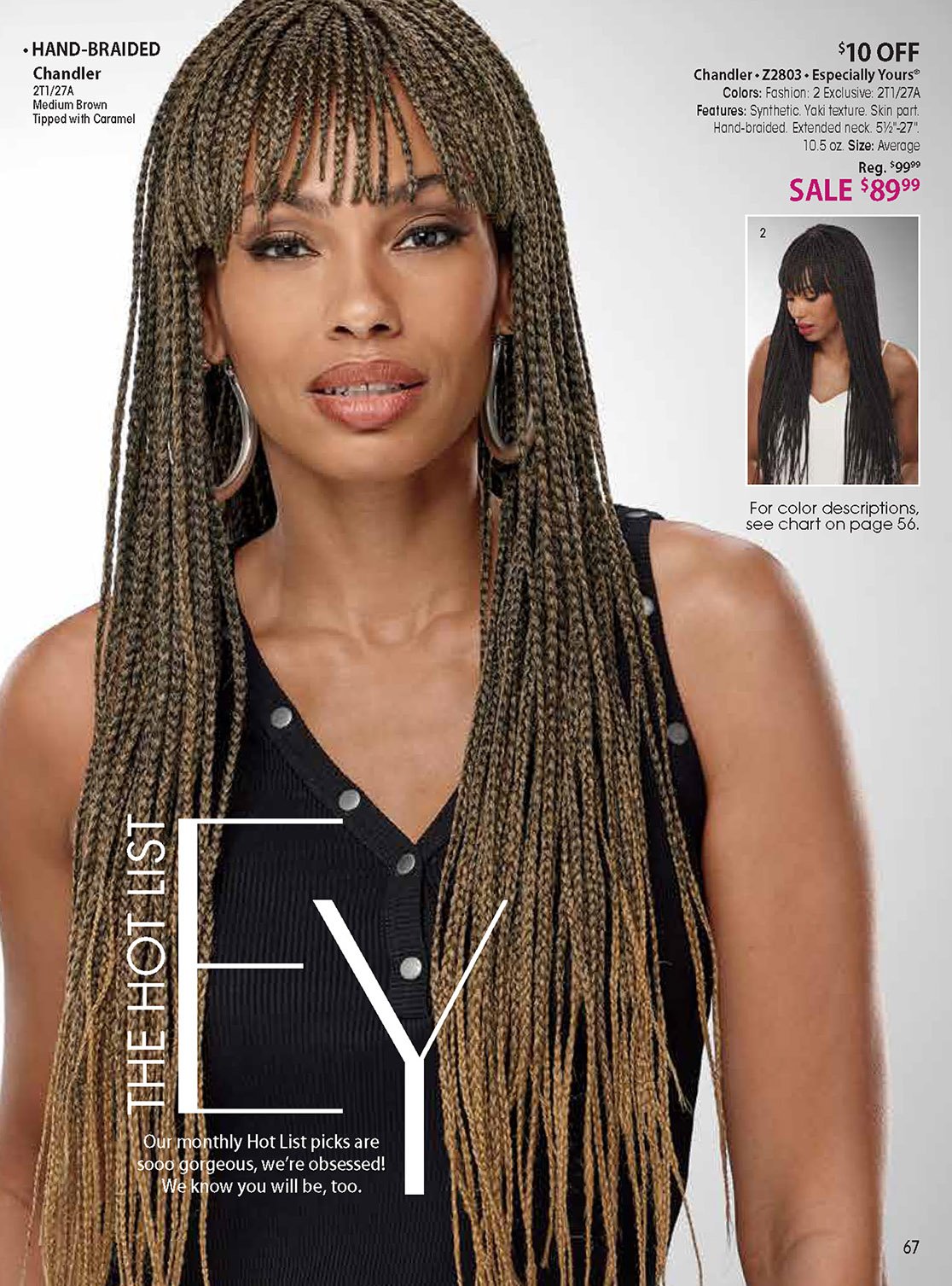
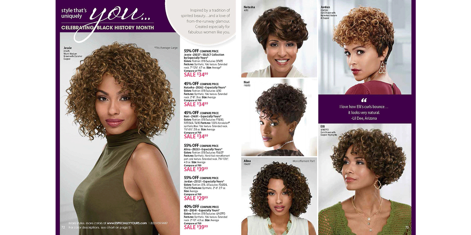
Aspirational to Authentic: Visual Pivot
The rise of the social justice movement marked a shift in our clientele’s values, and EY needed to respond. The brand’s usual aspirational tone felt out of sync with the moment. Our client didn’t want to blend in, she wanted to feel proud, seen, and uniquely herself. I led the pivot of the creative direction toward authenticity, celebrating individuality and natural beauty. Visually, this meant stripped-down sets that allowed the product and the model’s emotion to take center stage. The imagery and tone of voice now prioritized personal expression over perfection. The result felt honest, intimate, and empowering, resonating deeply with our audience.
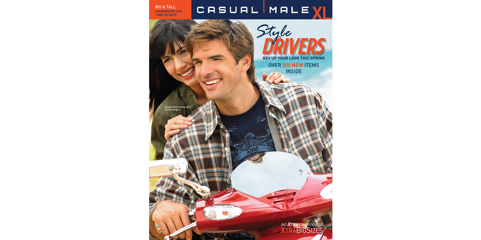
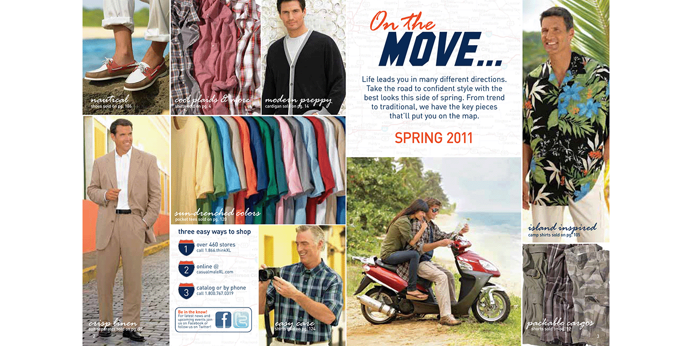
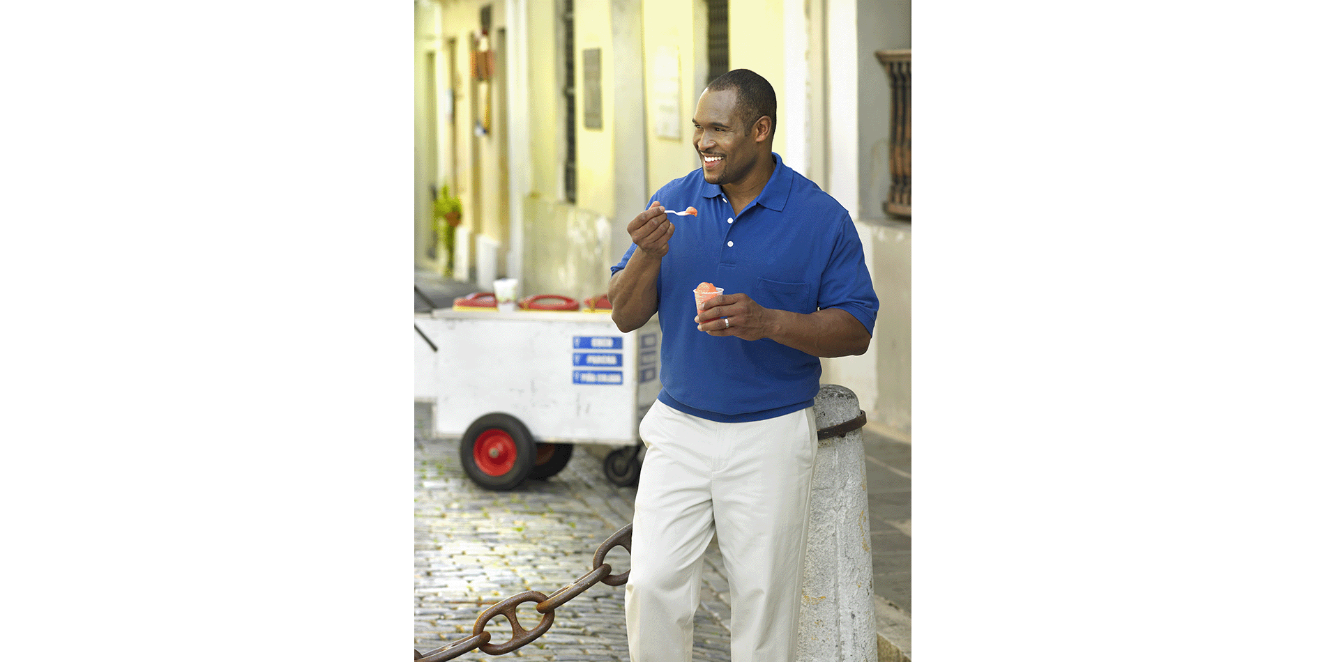
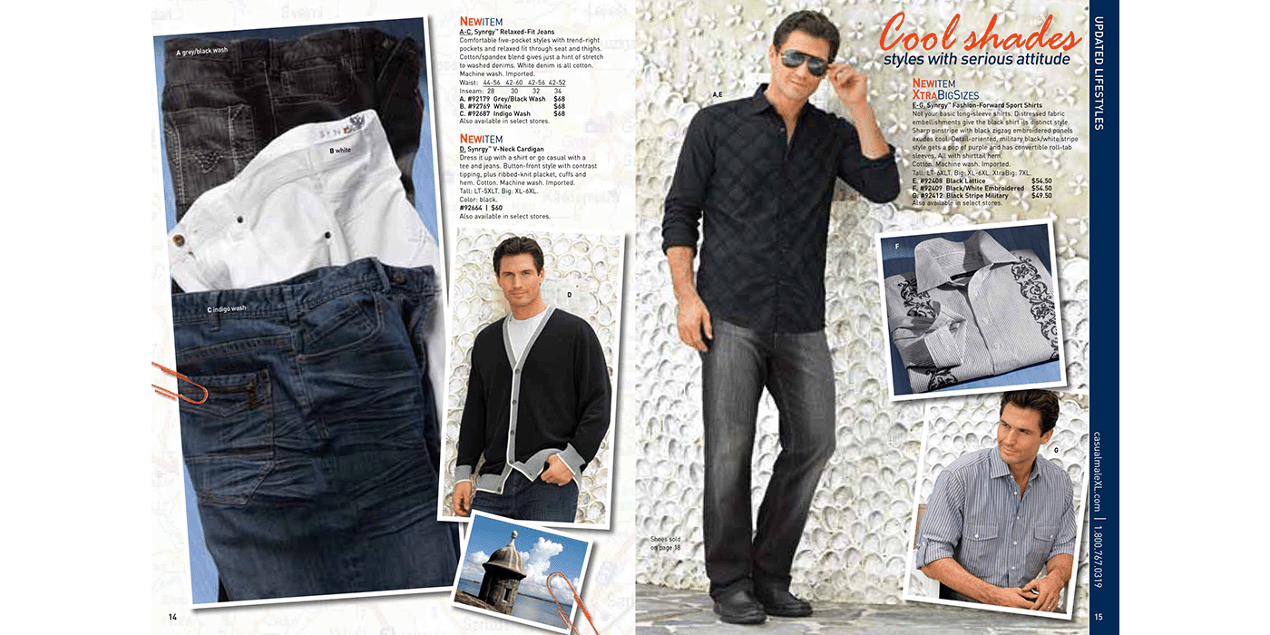
Style Drivers
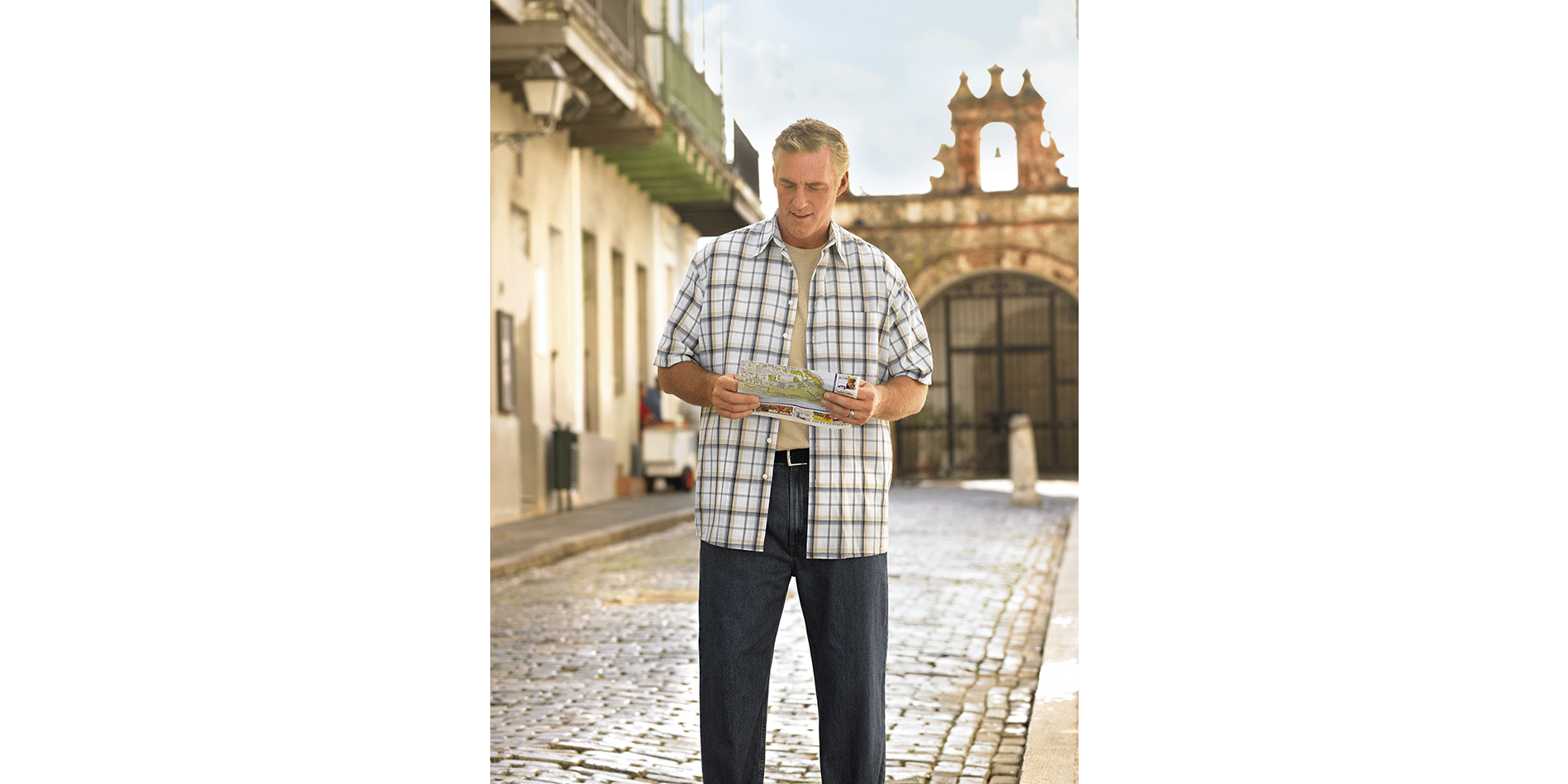
Creating fresh themes for each catalog drop was a challenge I always embraced. Whether it was spring, summer, or fall, each season needed a distinct and engaging story. Photographing spring collections in late fall often meant traveling to warmer climates—and if we had to travel, why not make the location part of the story? For this campaign, we chose the vibrant backdrop of Puerto Rico, weaving it into the narrative with a "travel log" concept—a map to great style and adventure. The location didn’t just serve as scenery; it became an integral part of the storytelling. I even had the chance to include some of my own travel photography, adding authenticity and an immersive feel to the campaign.
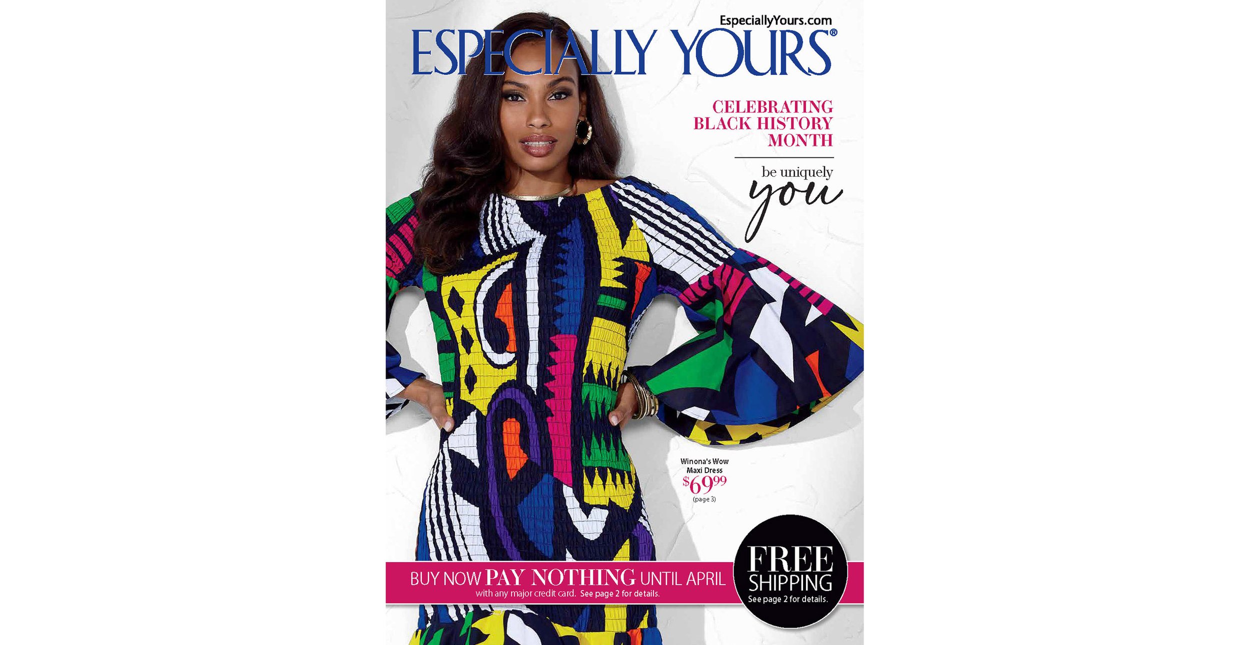
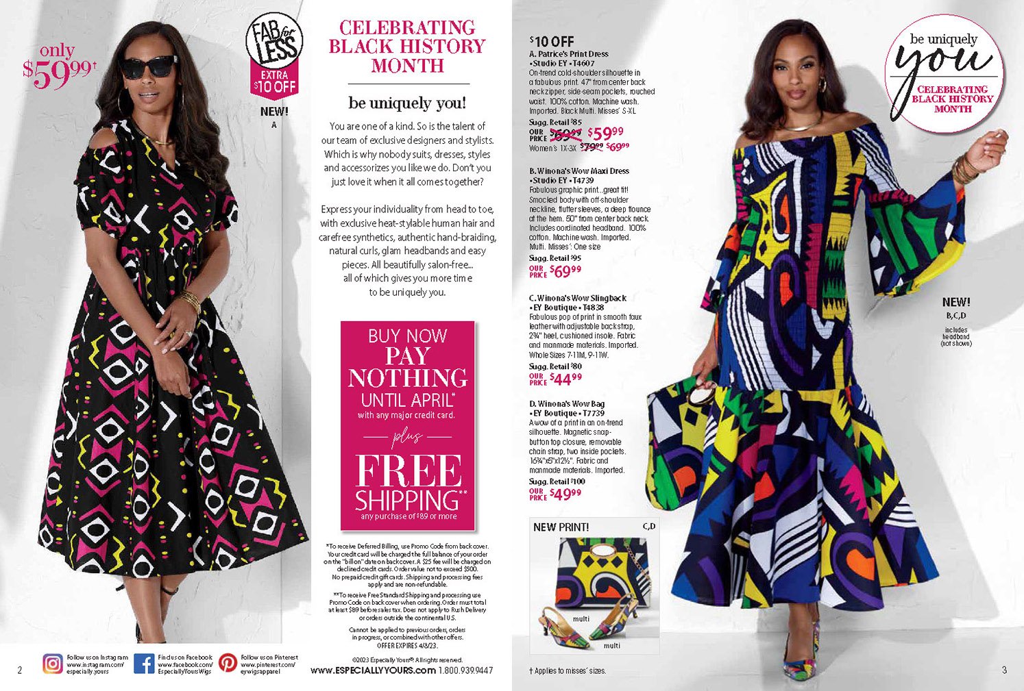
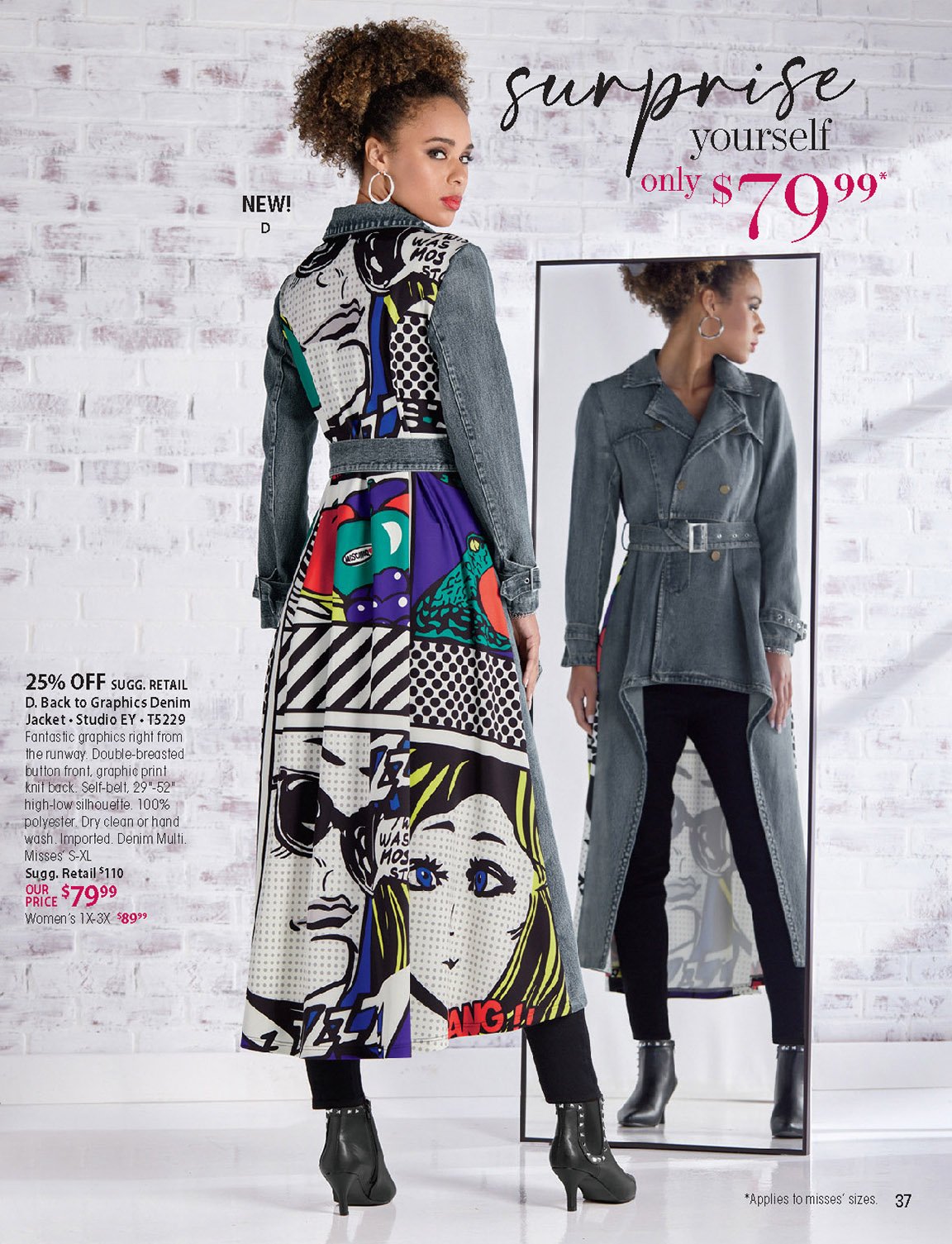
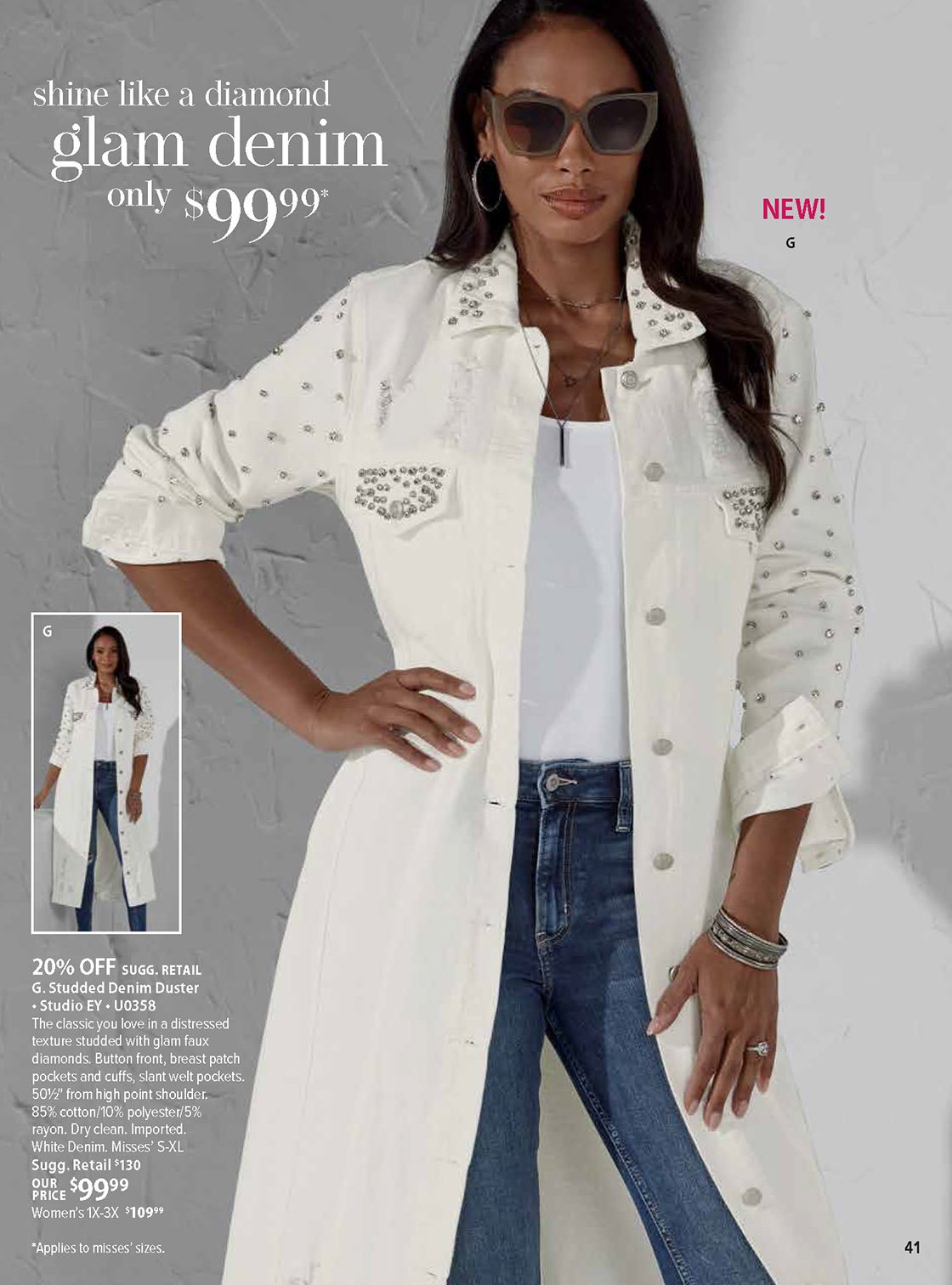
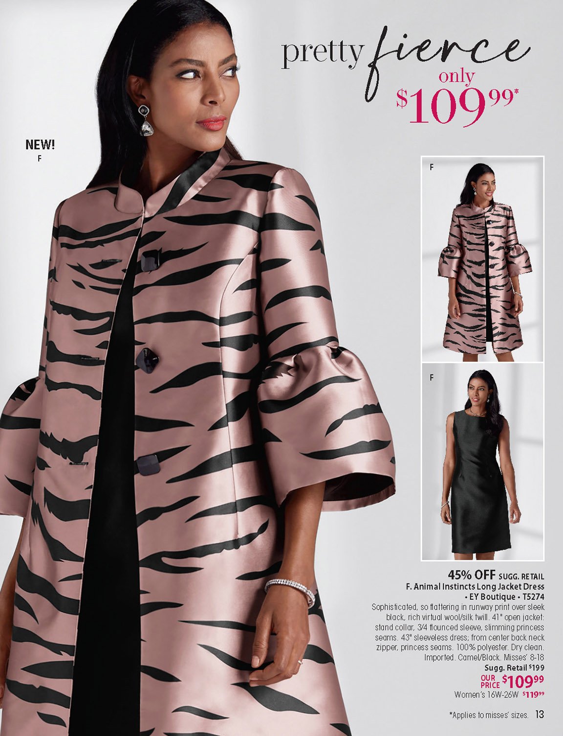
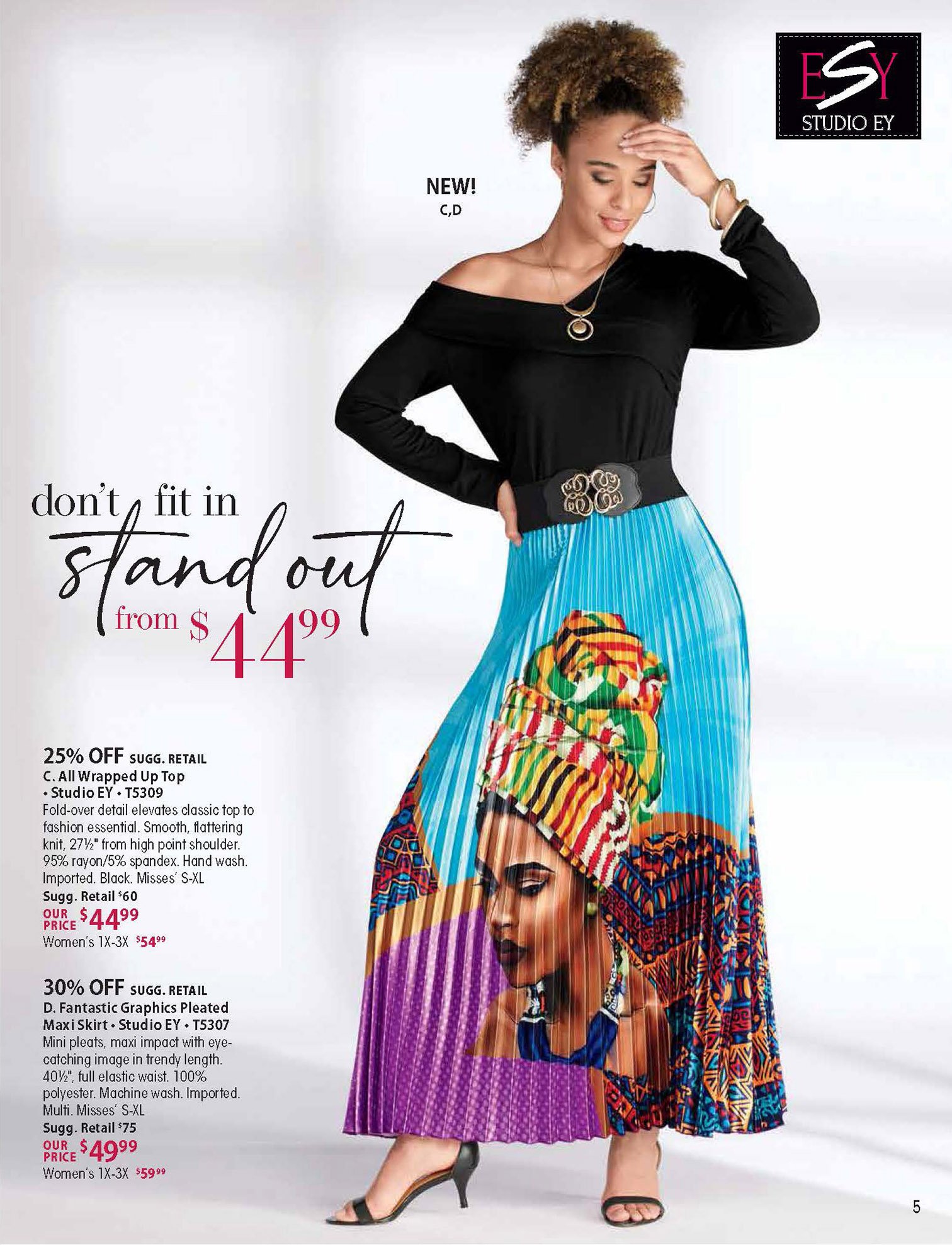
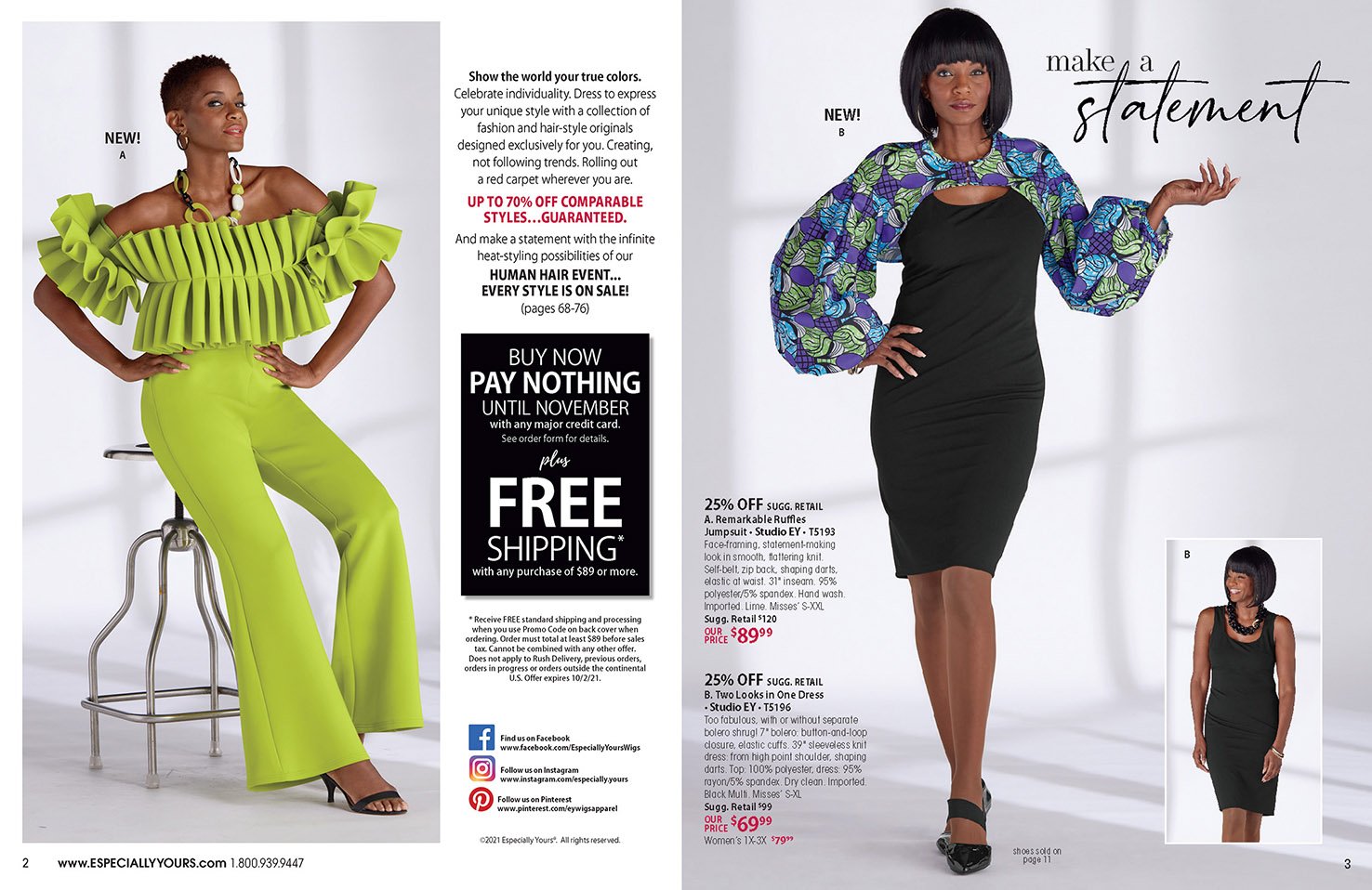
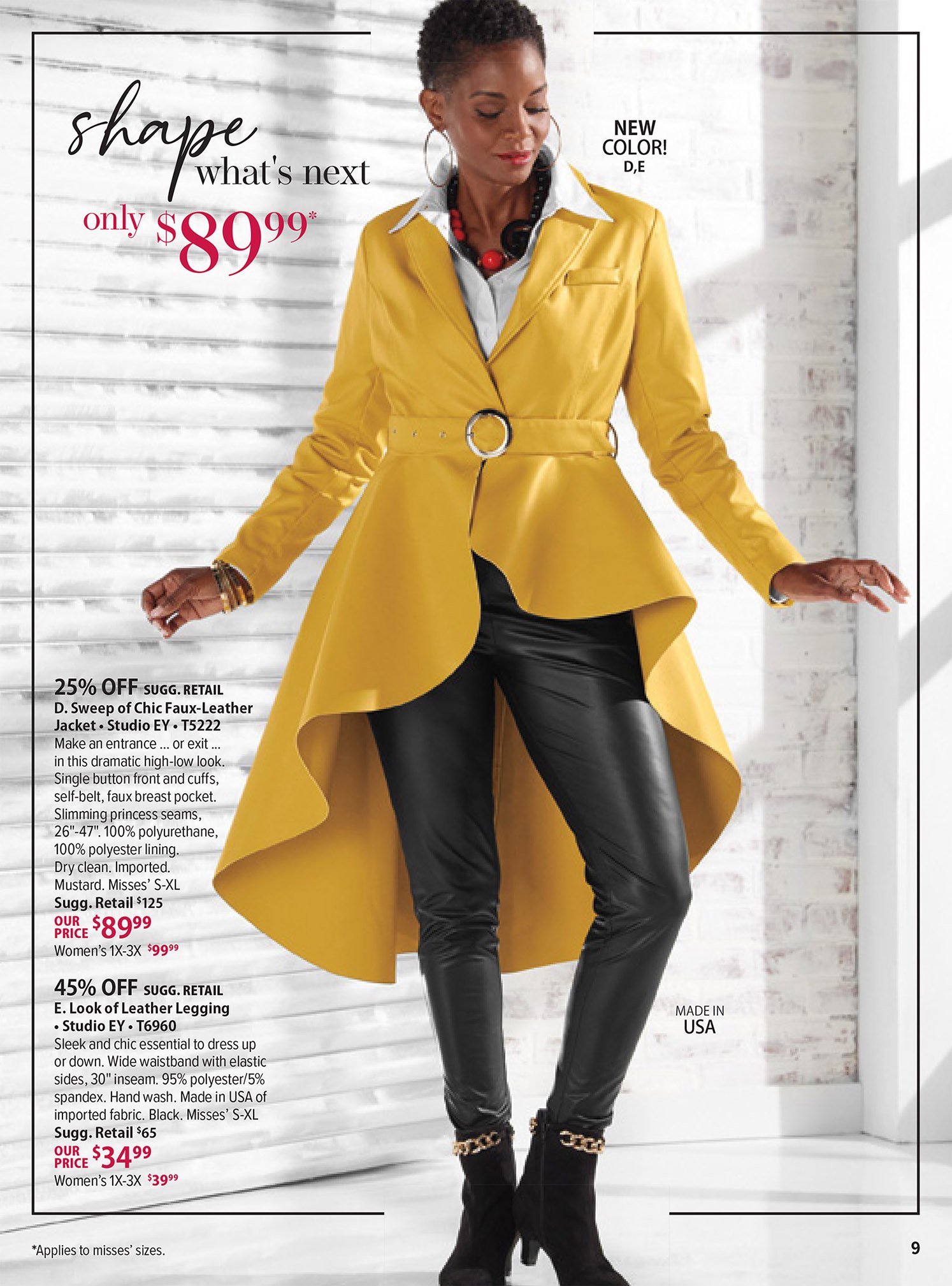
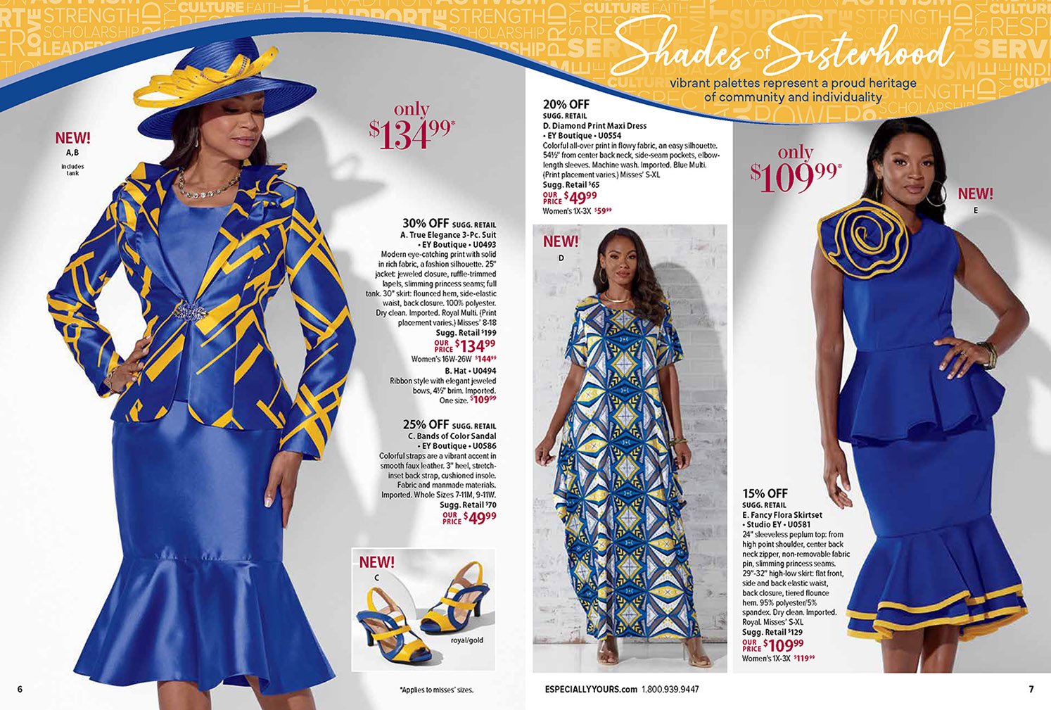
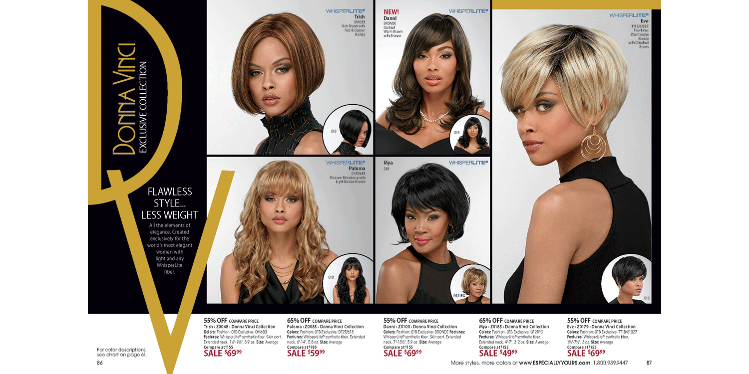
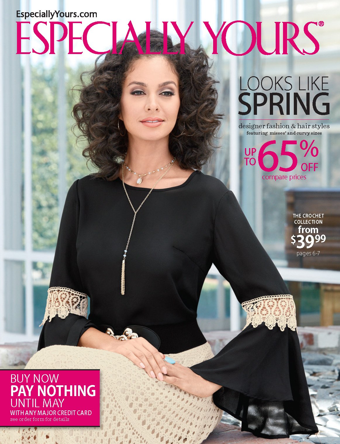
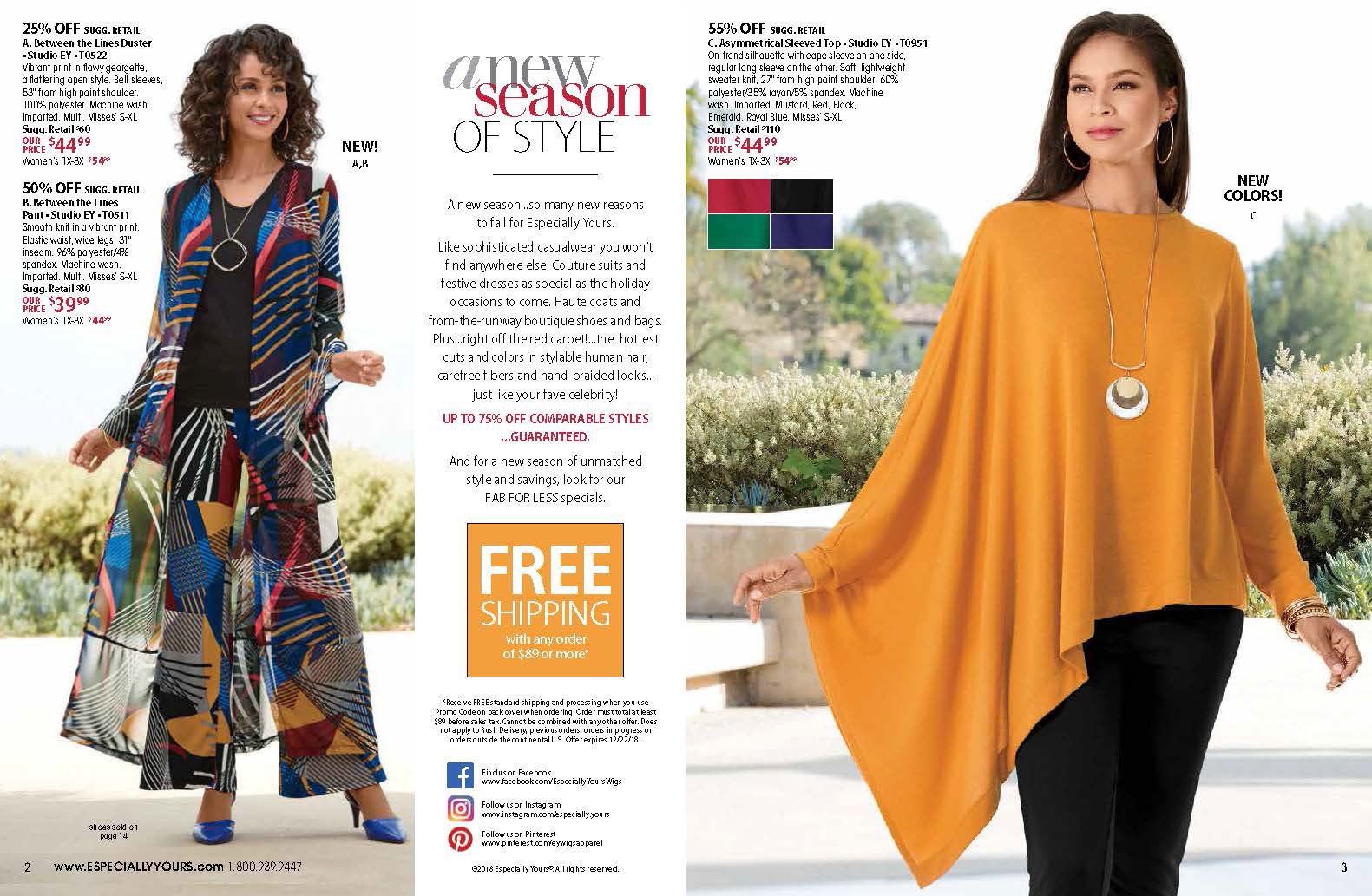
Brand Refresh & Update
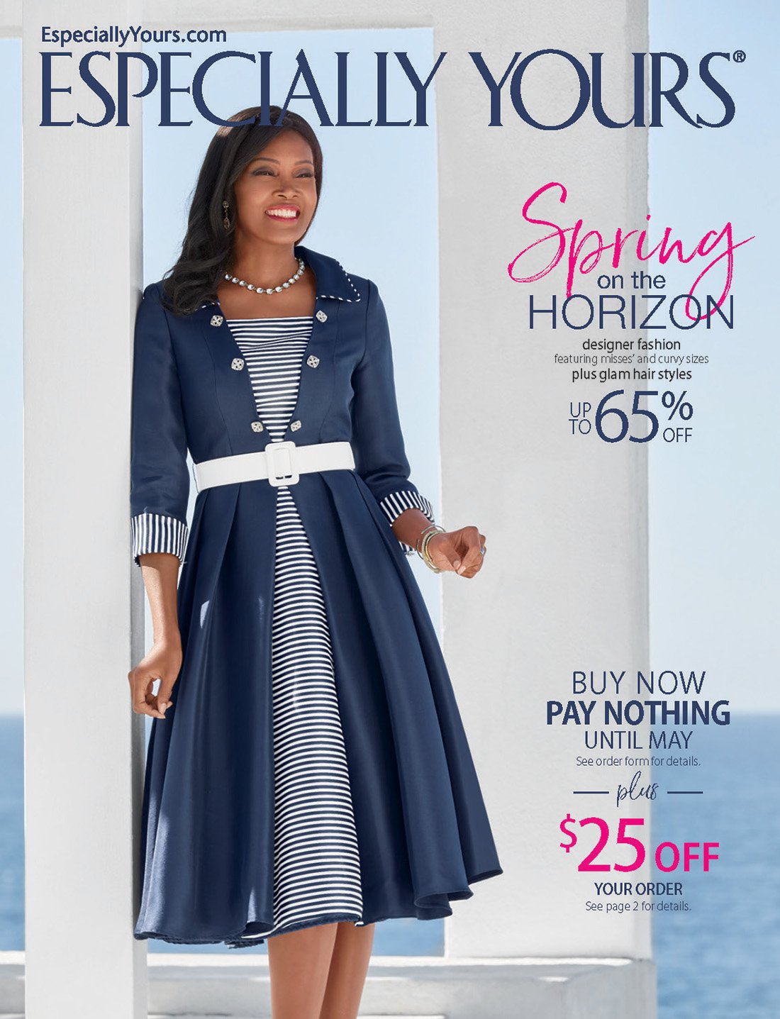
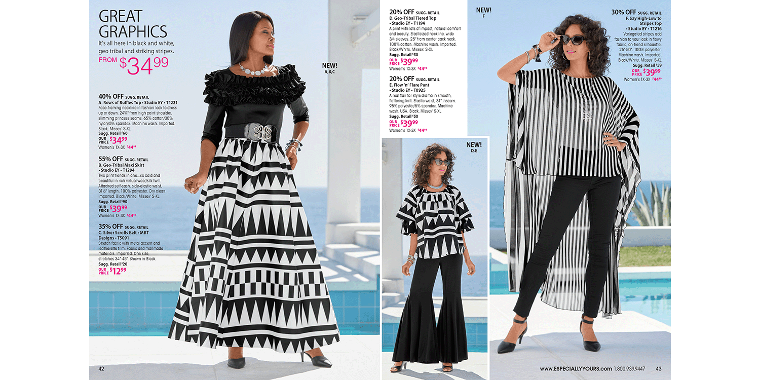
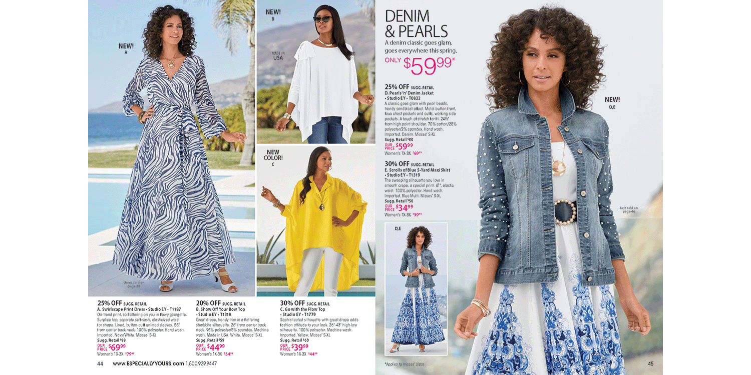
As the leader of the Especially Yours (EY) creative team, my primary responsibility was to redefine the brand’s visual approach. The existing layouts were cluttered and challenging to shop, often overwhelming the customer with too many competing elements. My goal was to simplify and elevate the shopping experience by designing clean, product-focused pages that clearly communicated the brand’s core attributes: aspirational style, affordability, and accessibility. By streamlining the design and letting the product shine, we created layouts that were both visually appealing and commercially effective.
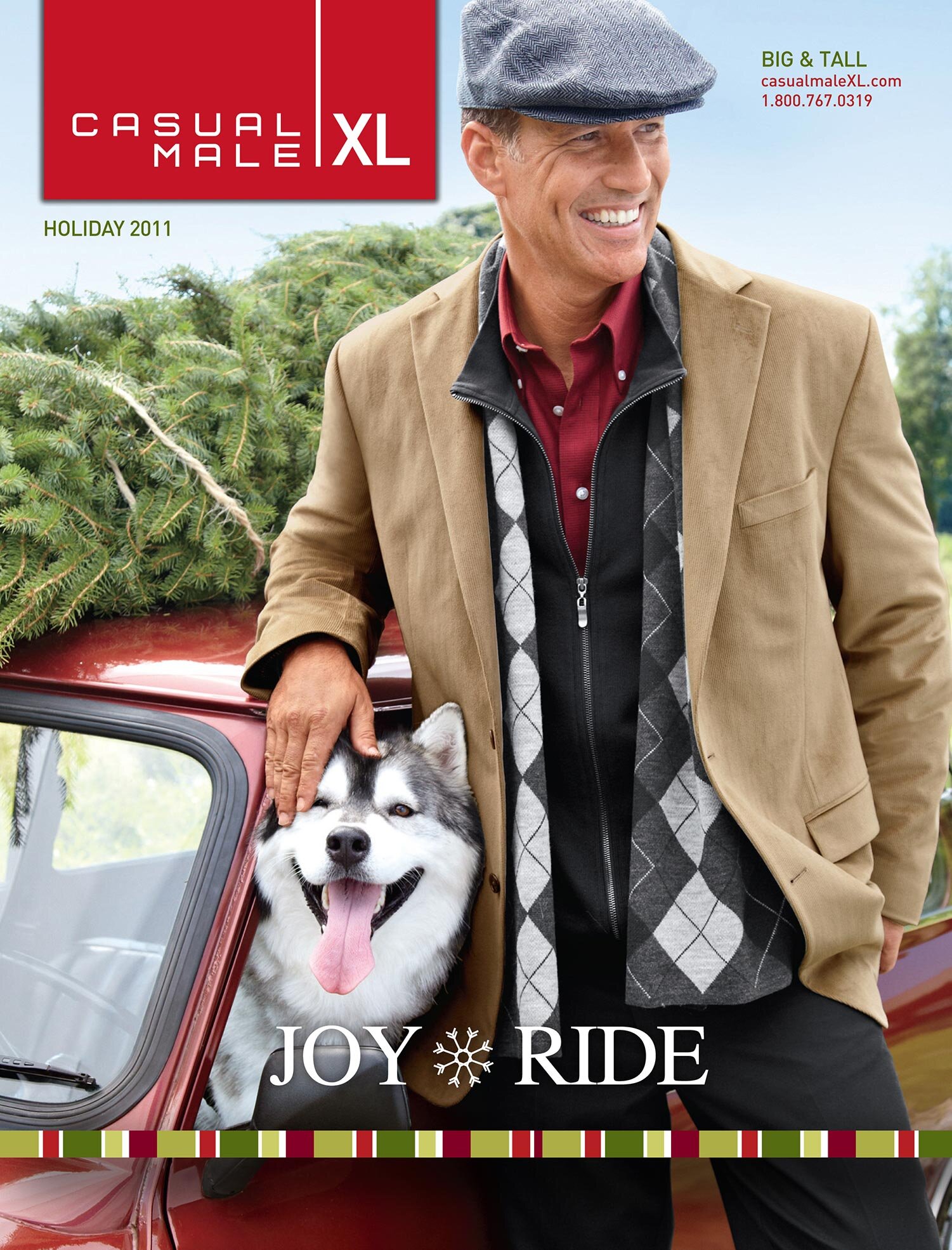
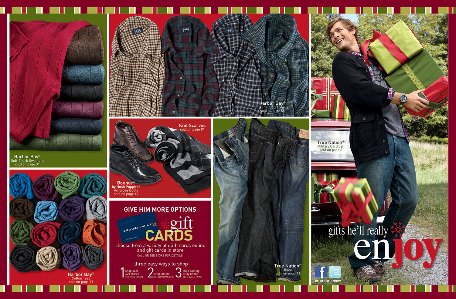
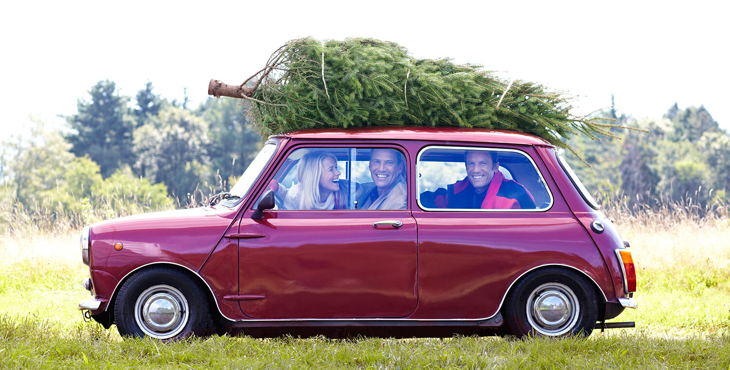
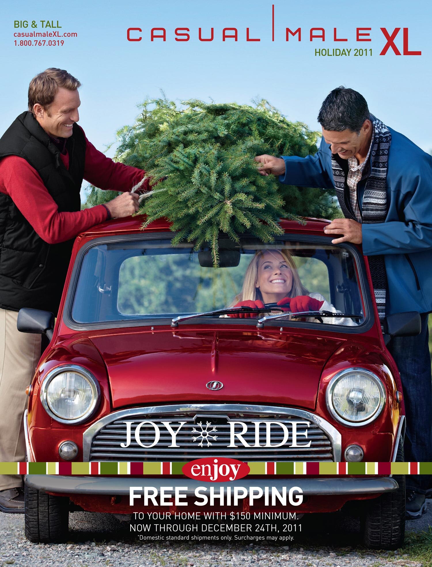
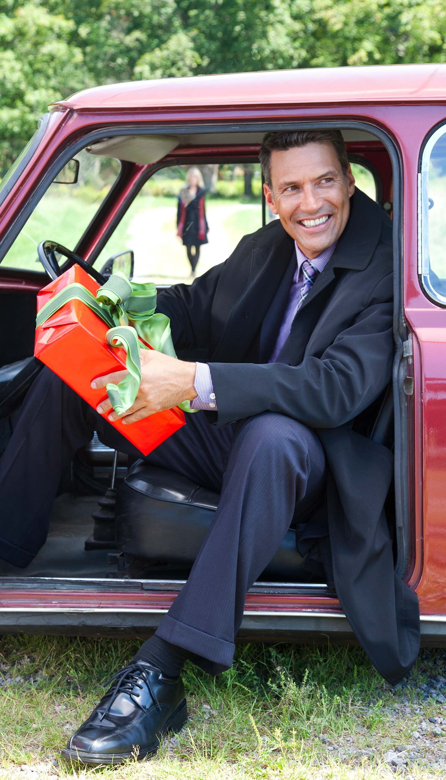
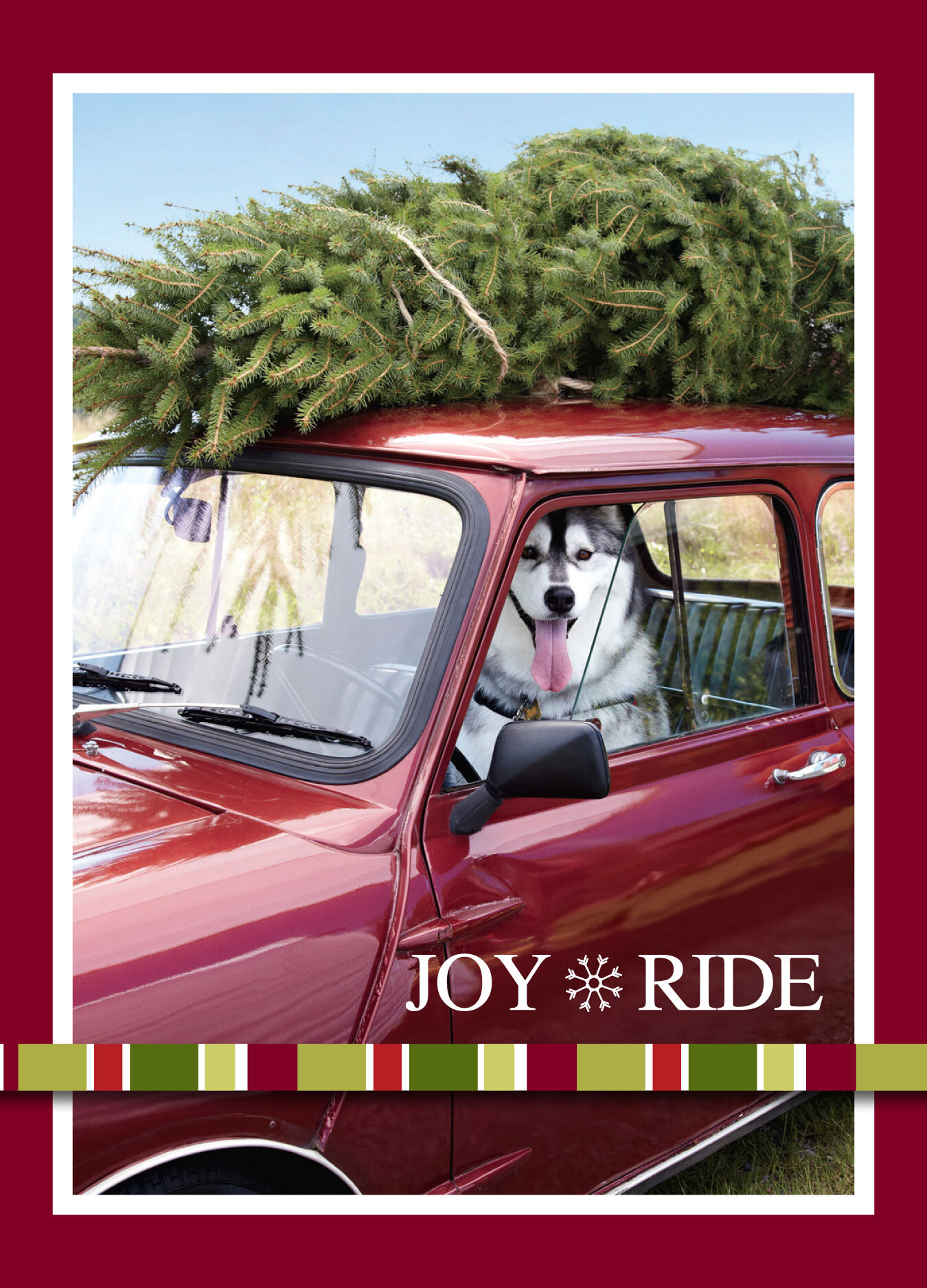
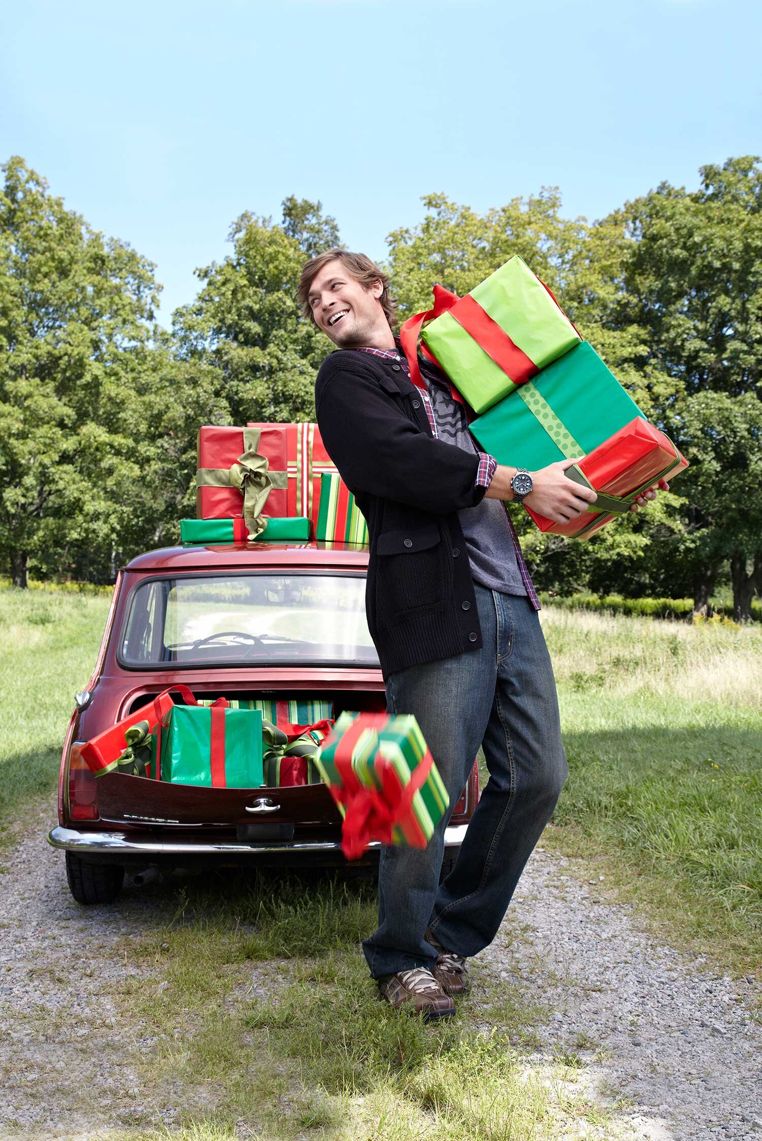
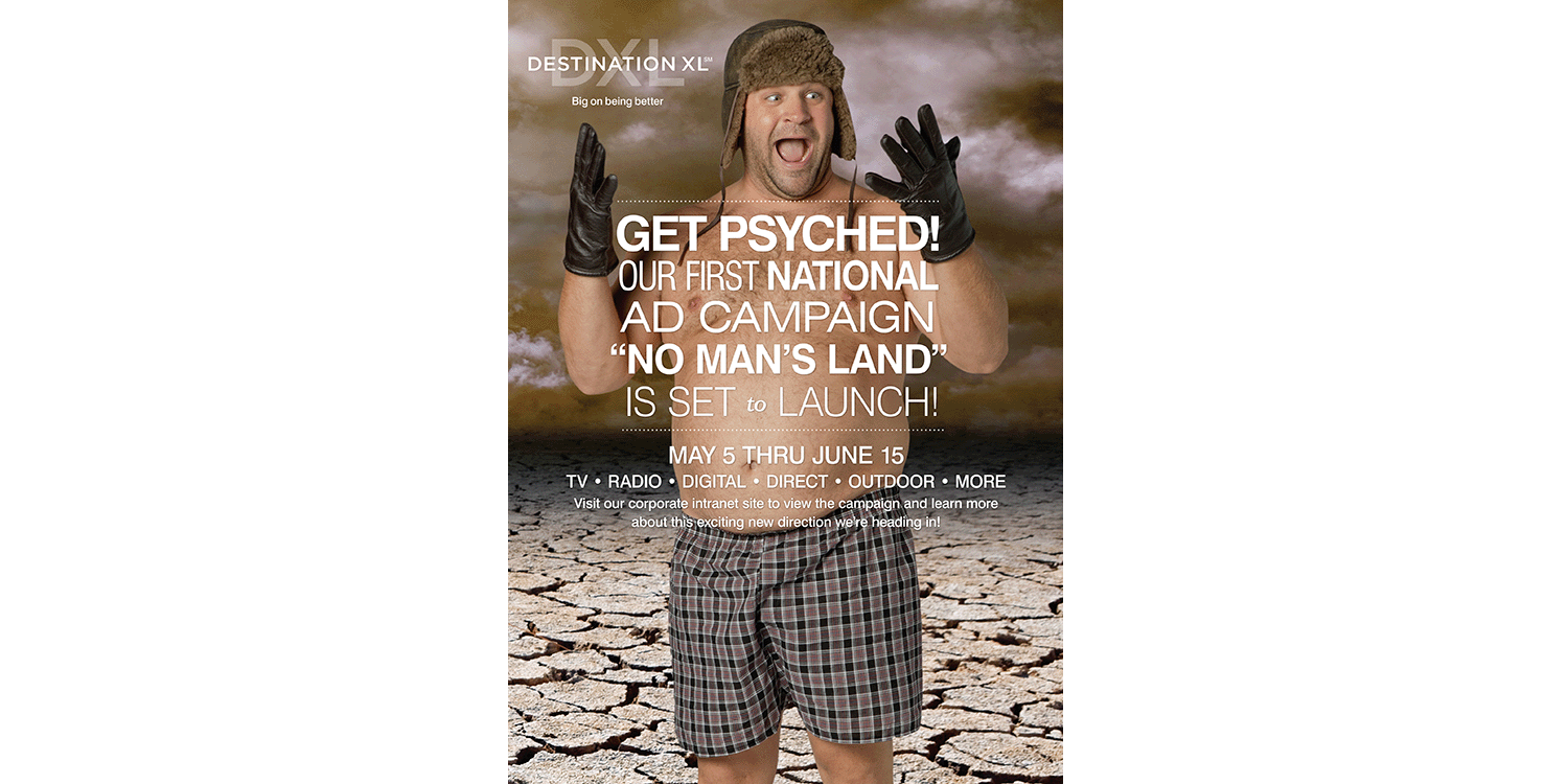
Joy Ride
As the creative lead for the Casual Male brand, my role involved developing compelling seasonal campaigns that resonated across all channels. But creating impactful visuals was only part of the challenge—bringing a winter holiday campaign to life in the middle of July posed its own unique hurdles. From sourcing a Christmas tree in the summer to navigating unseasonably hot weather, every detail required creative problem-solving. And if we were going for challenging, why not take it a step further and add a dog to the mix? Challenges like these are what make the creative process both demanding and incredibly rewarding.
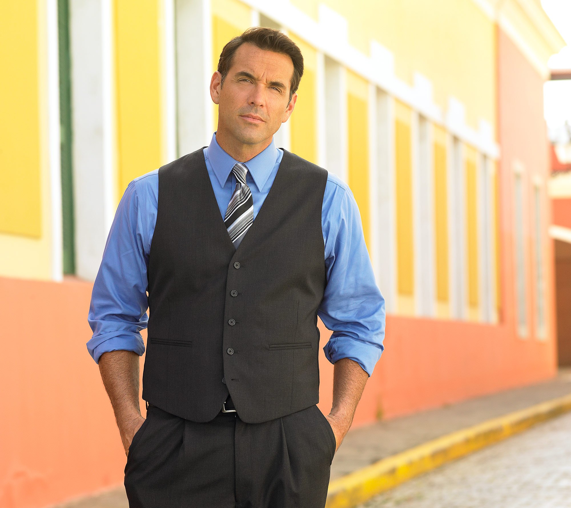
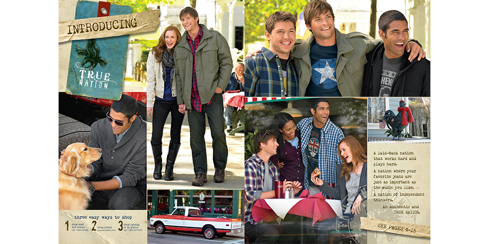
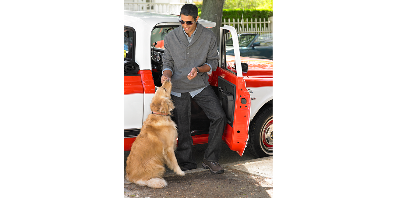
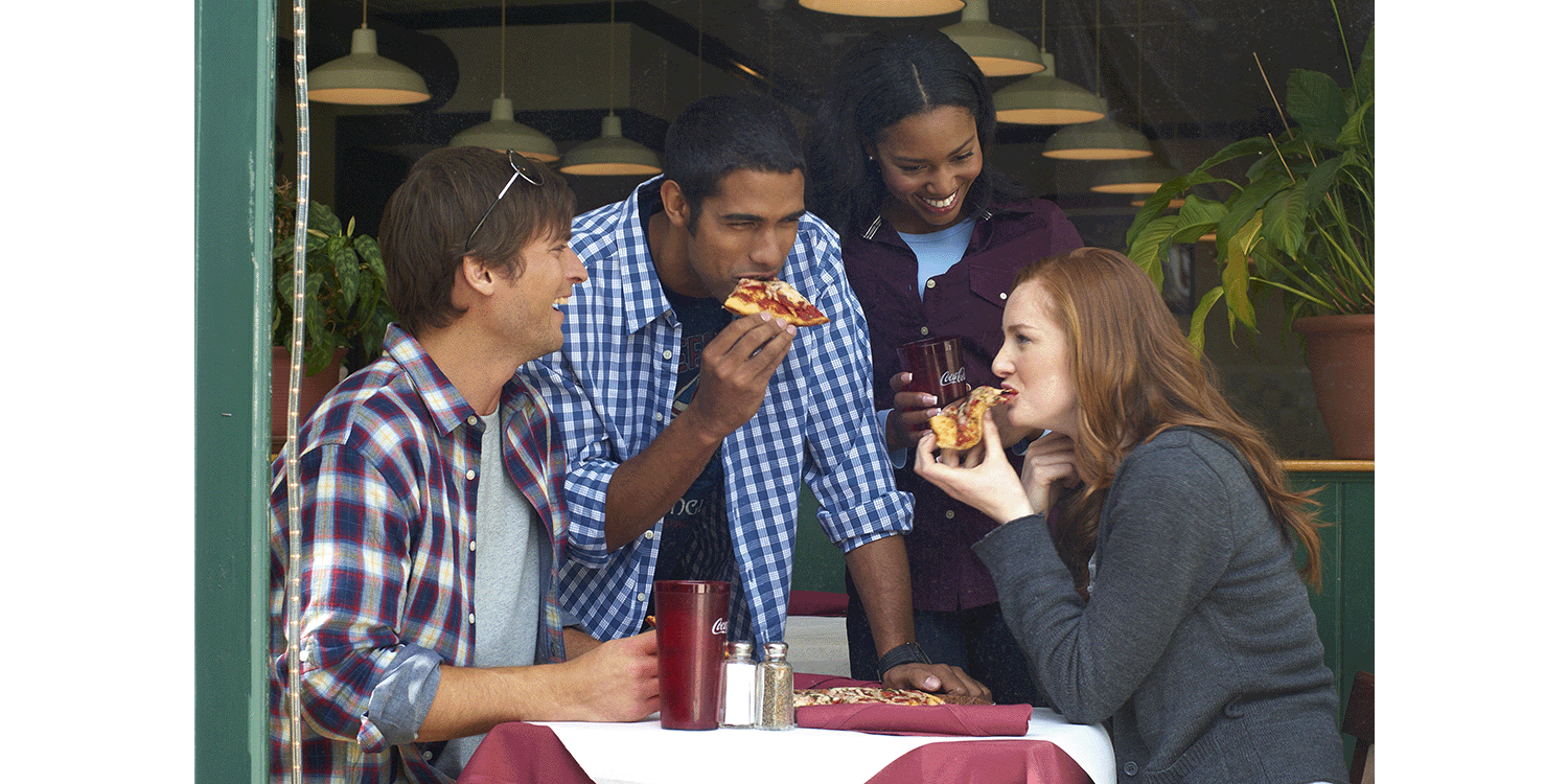
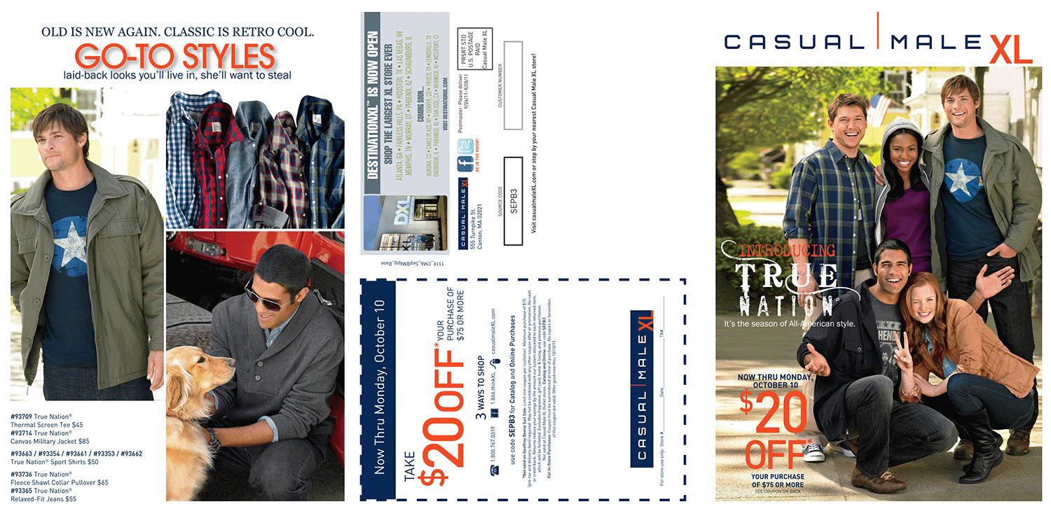
True Nation®
When launching a new clothing brand, it's essential to build a strong visual story that reflects its identity and values. That was the challenge with the introduction of True Nation®, a brand designed for the laid-back guy who works hard and plays hard. Our goal was to create imagery that felt effortless yet purposeful—capturing the energy, confidence, and versatility of the True Nation man. From casting to styling, from location choices to layout design, every element had to tell a cohesive story that would resonate with a younger, more casual consumer while staying true to the brand’s core message.
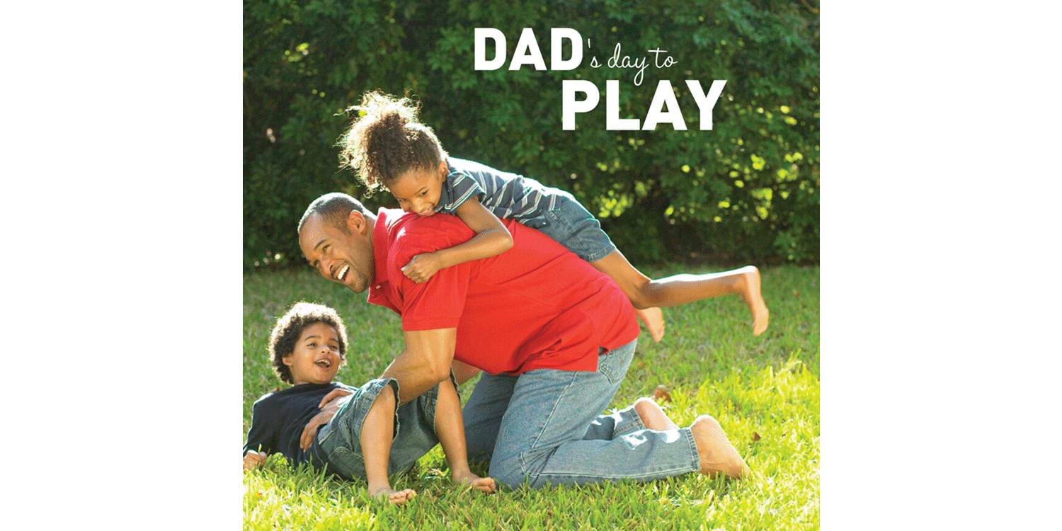
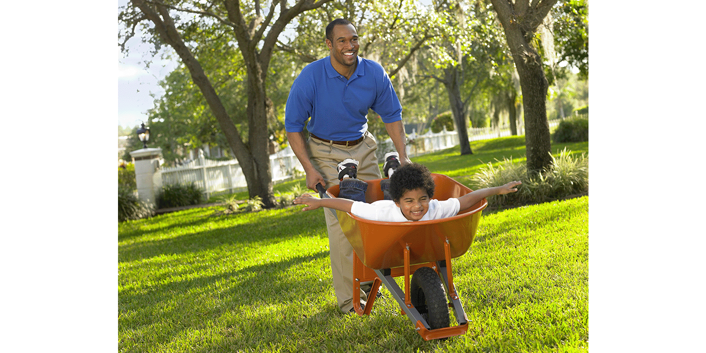
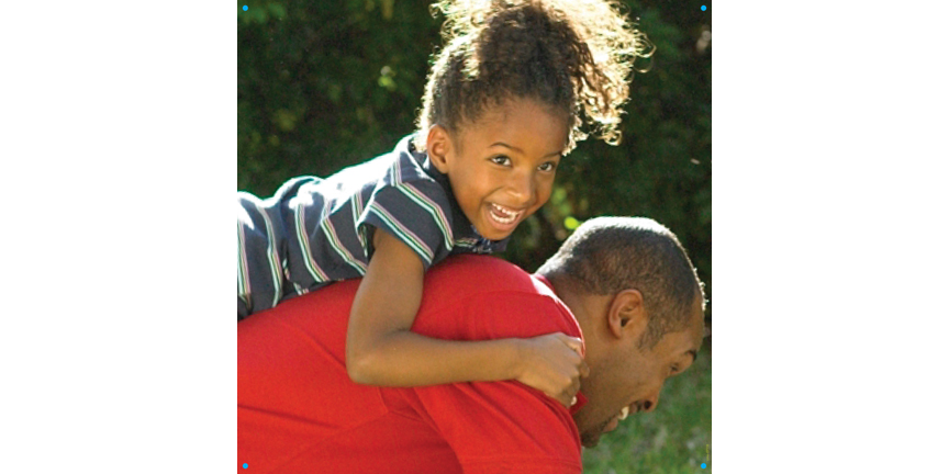
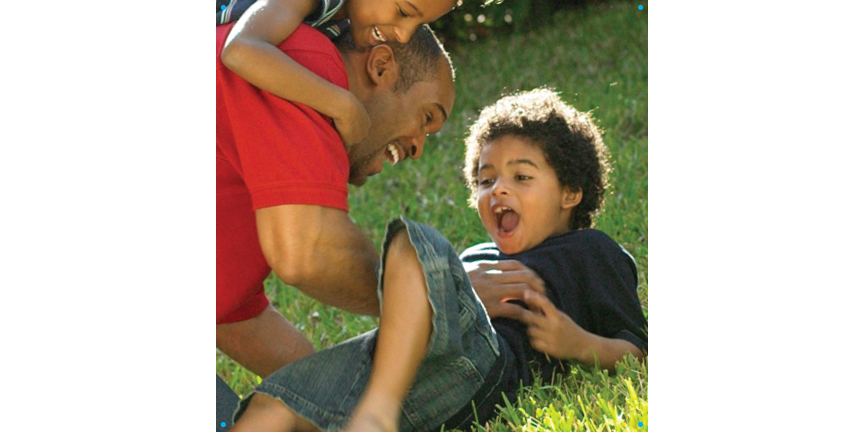
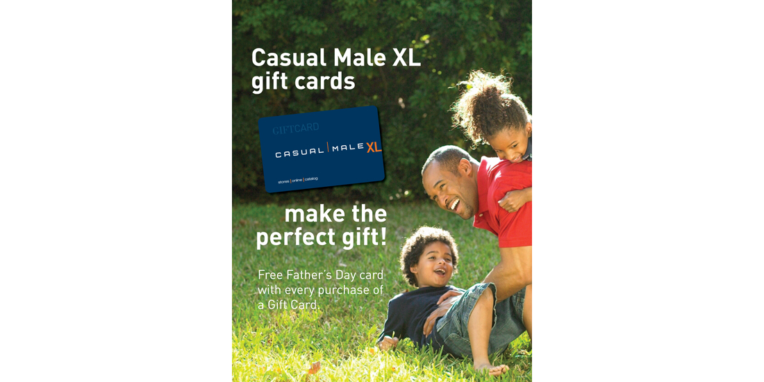
Father’s Day
Father’s Day was a key event in the Casual Male XL calendar, especially for brick-and-mortar stores and online platforms. Creating a fun, playful campaign with bold imagery and strong typography was essential to capture attention—whether someone is driving past a storefront or quickly scrolling online. The messaging needs to be clear, engaging, and instantly recognizable, making it easy for customers to connect with the promotion and take action. A visually dynamic approach helps convey the spirit of the occasion while staying true to the brand’s tone and audience.
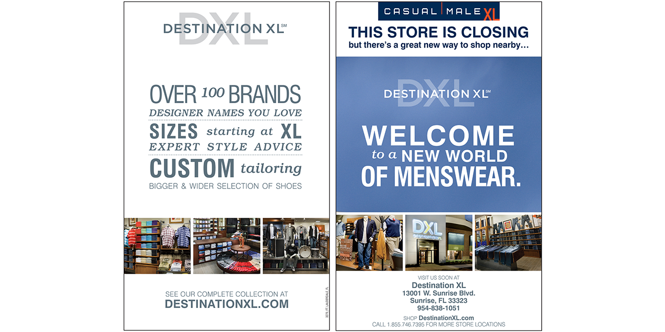
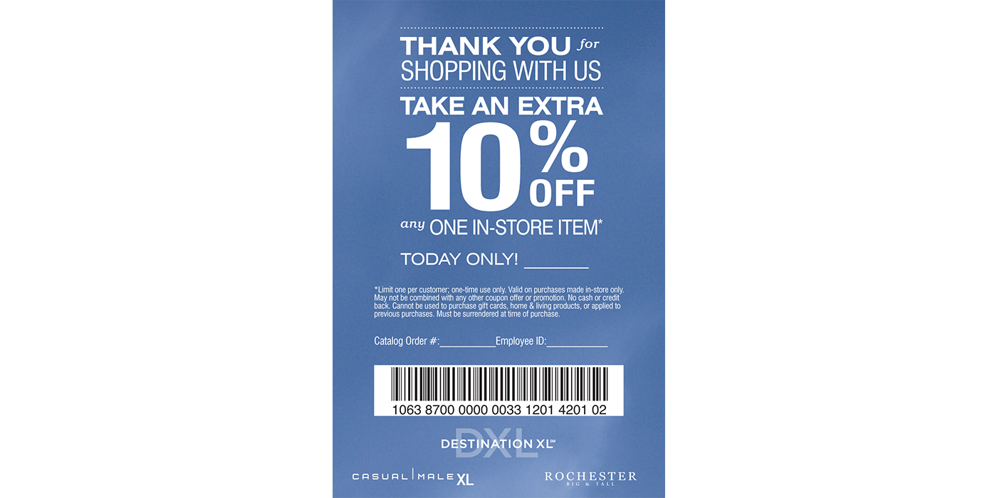
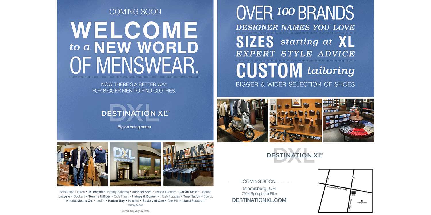
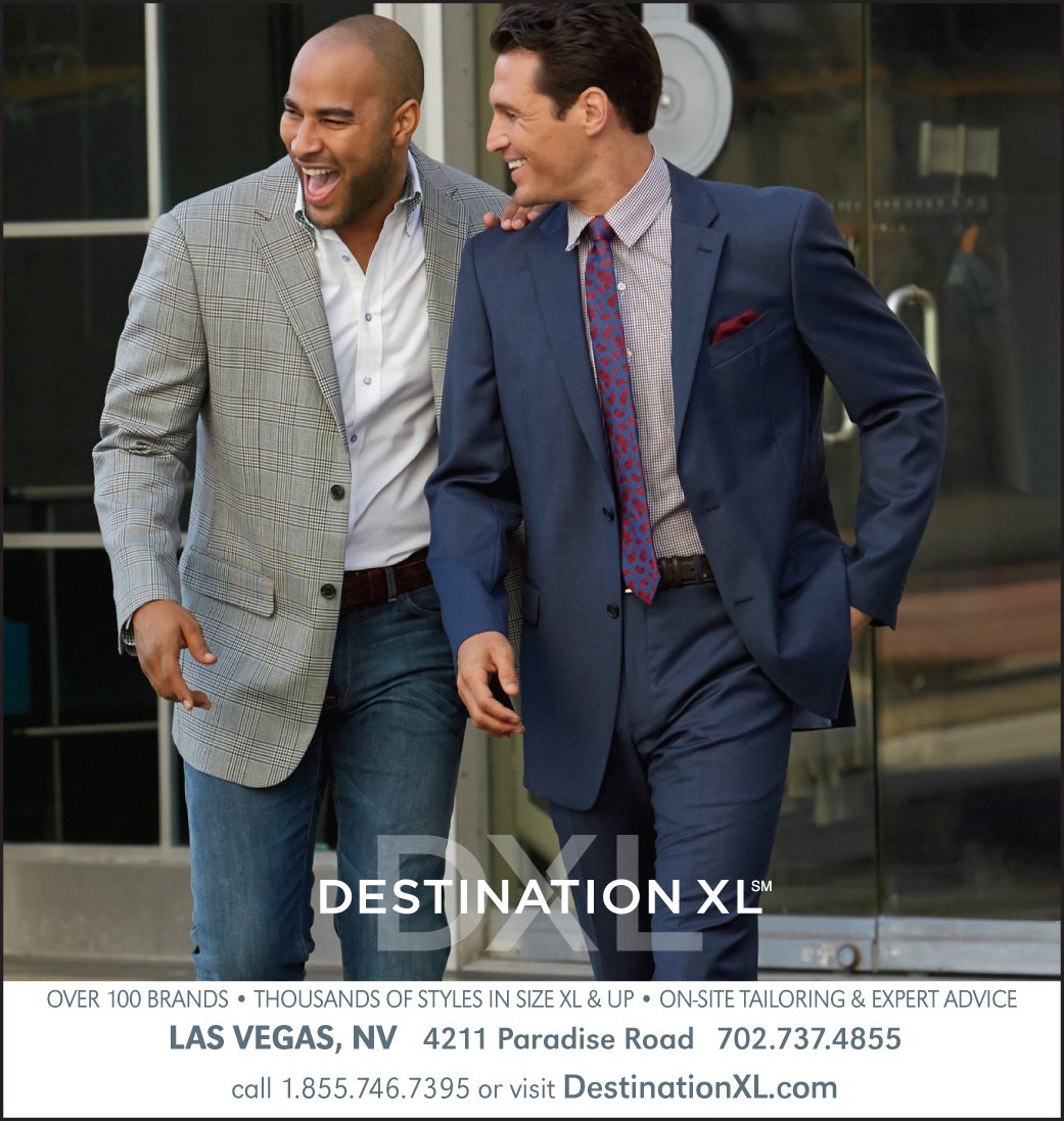
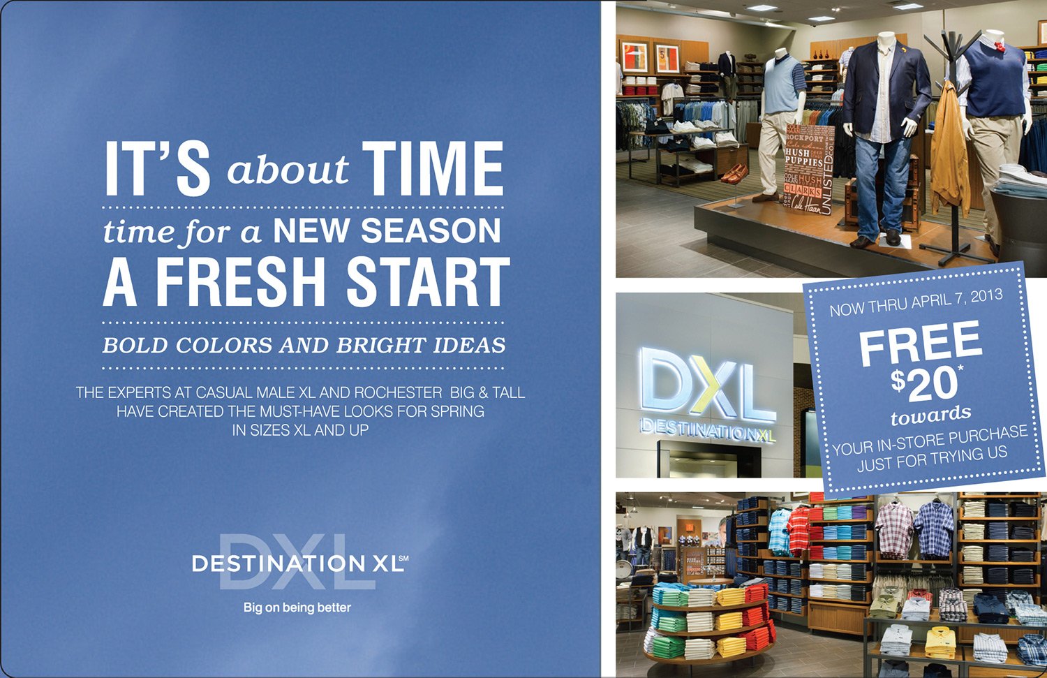
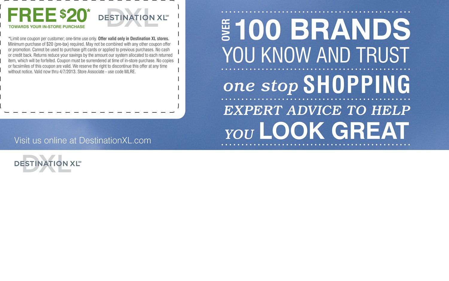
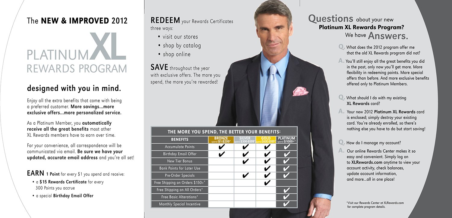
Destination XL
Destination XL (DXL) was launched as a company-wide initiative to unify all of its brands—from the most premium to the most affordable—under a single umbrella. The goal was to create a cohesive shopping experience tailored to big and tall men, empowering them to choose and wear what fits their style. One of the key challenges was integrating the existing brands, Casual Male XL, B&T, Living XL, and Shoes XL, into the new DXL identity without alienating their loyal customer base. As part of the transition team, I helped develop support materials that facilitated this shift while still maintaining the unique identity and independence of each brand.

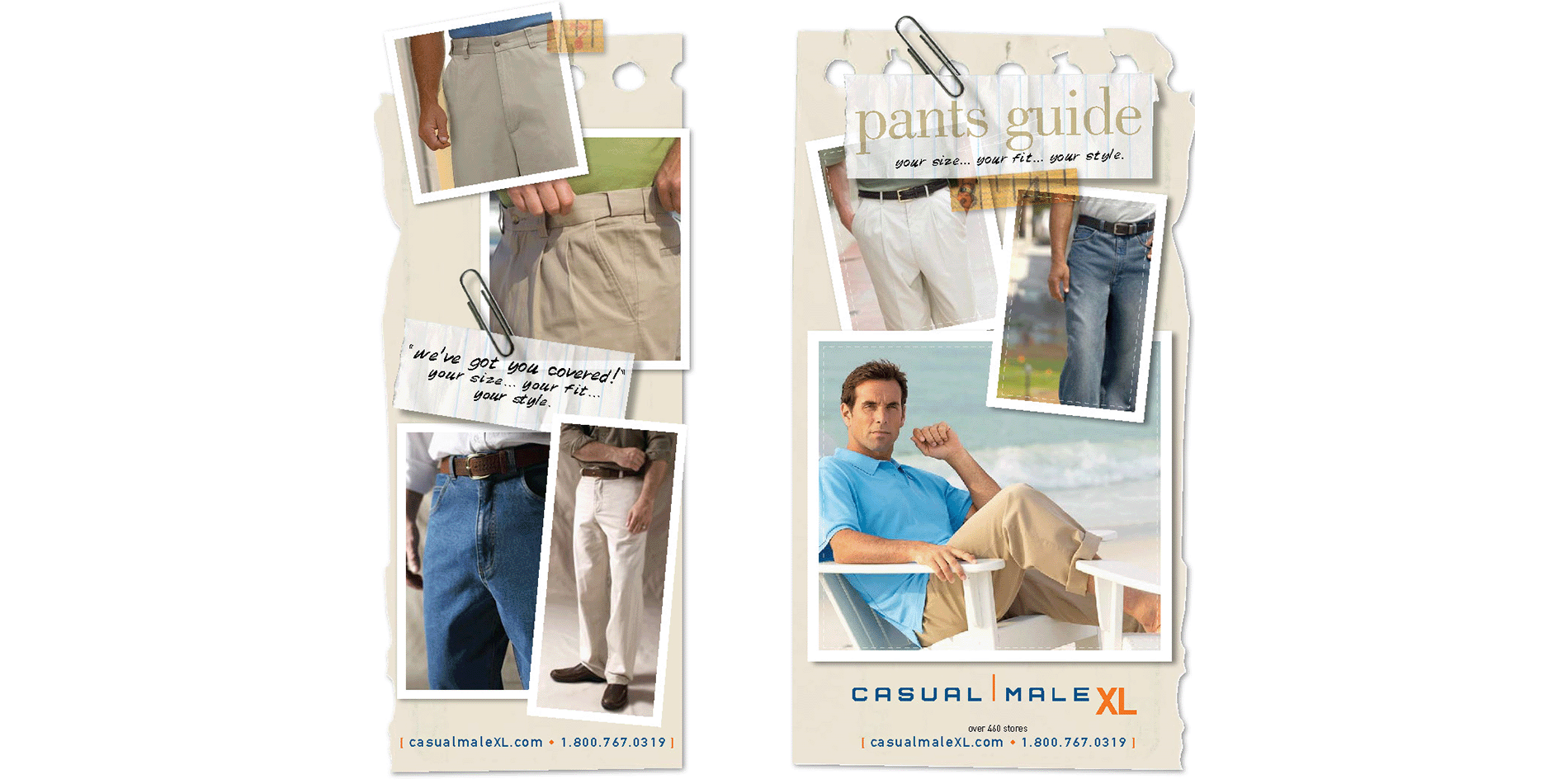
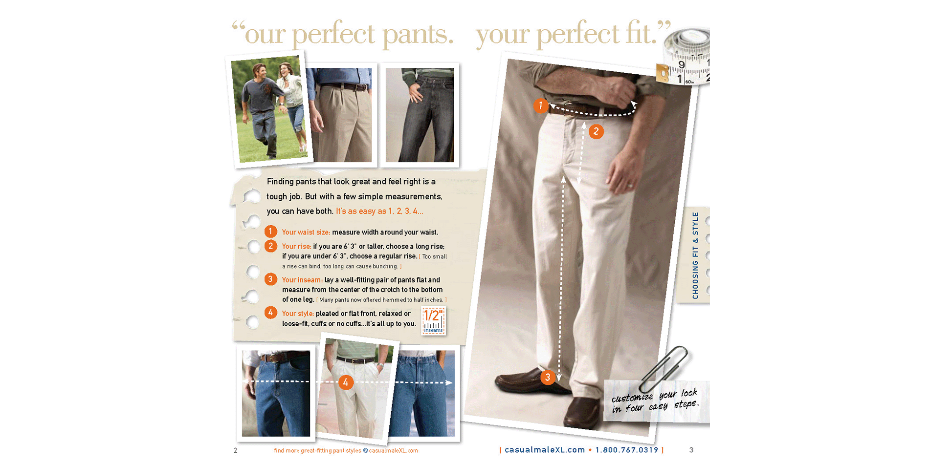
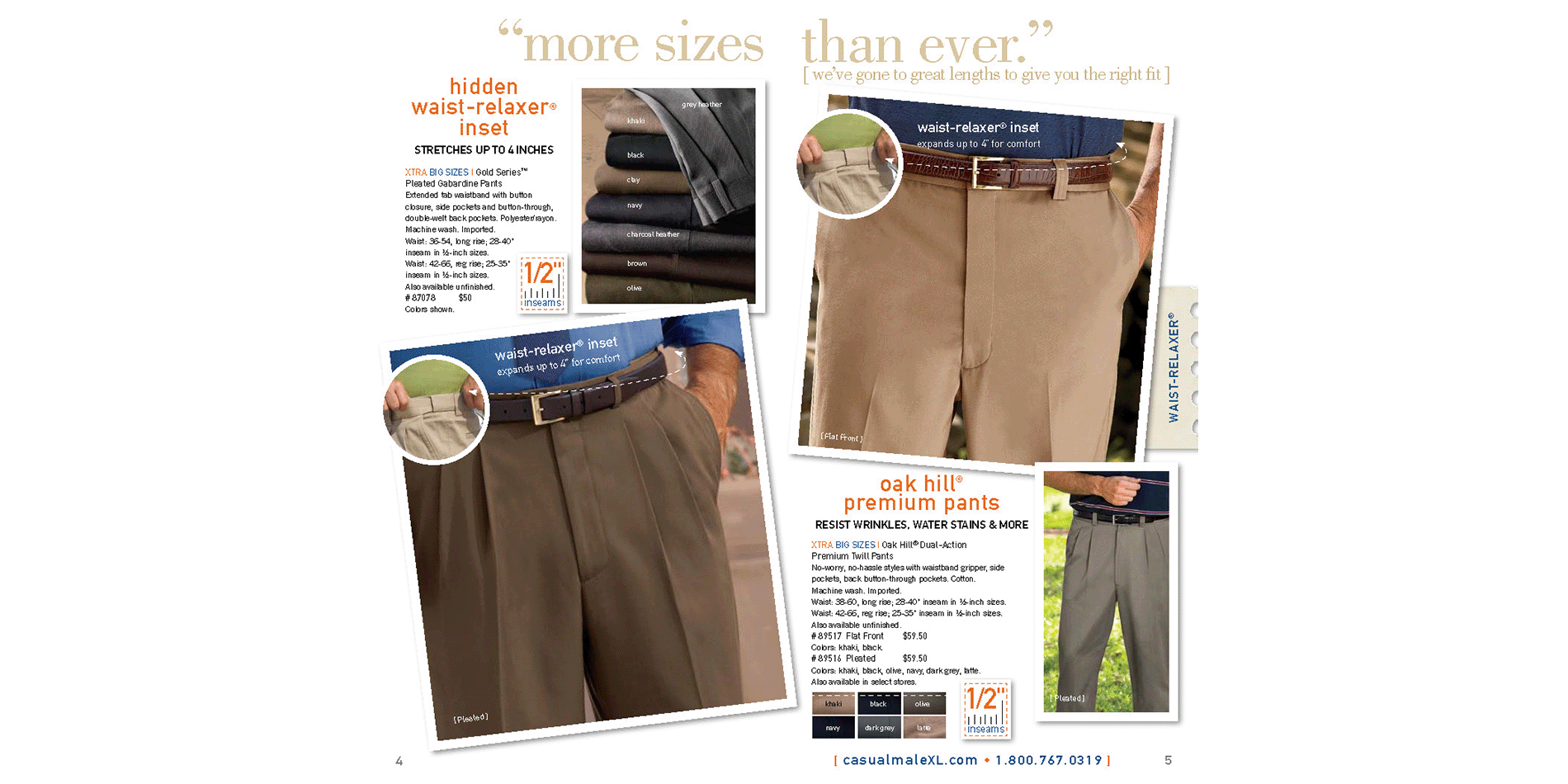
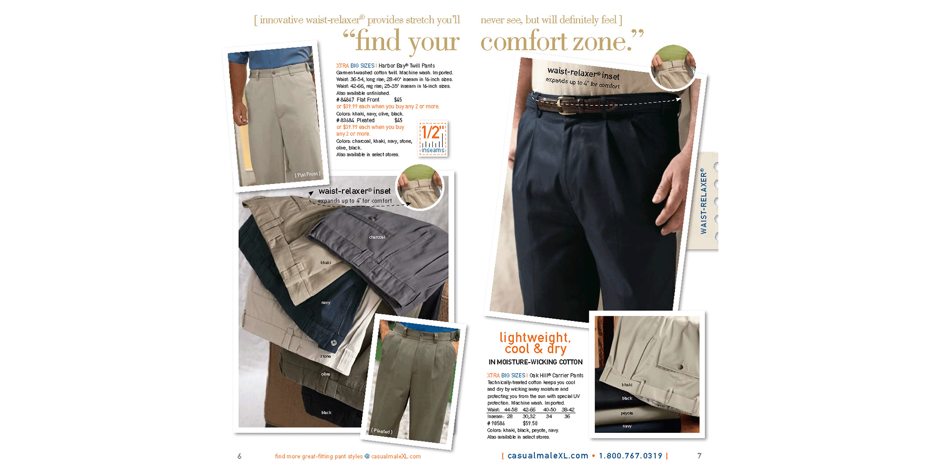
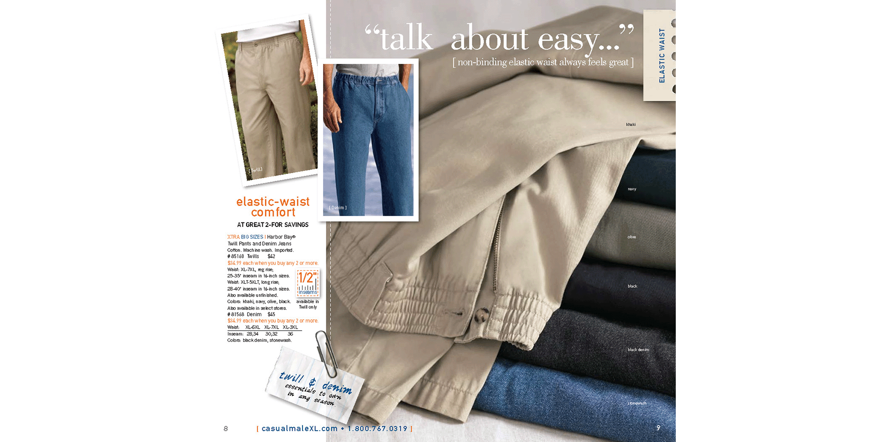
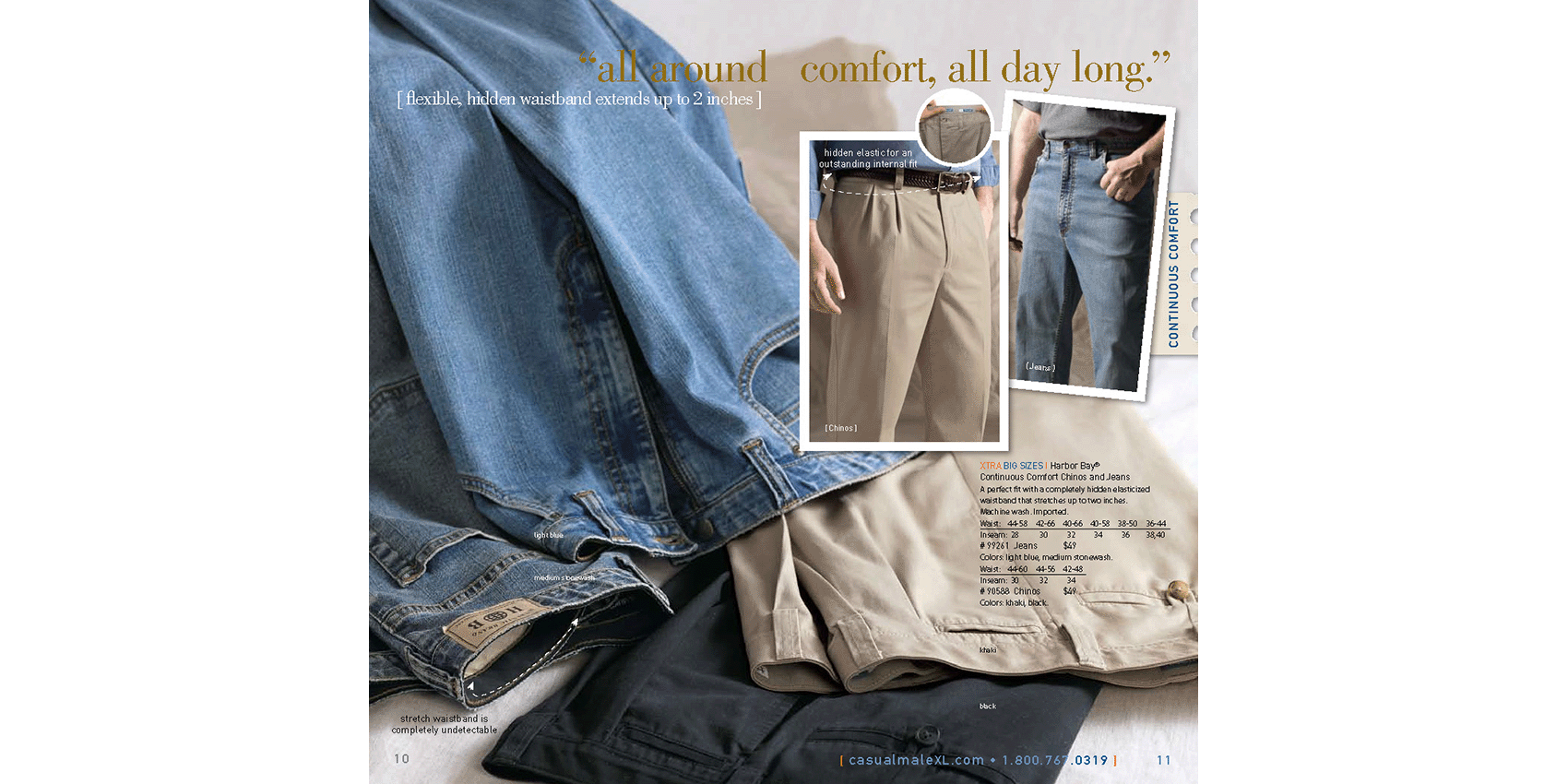
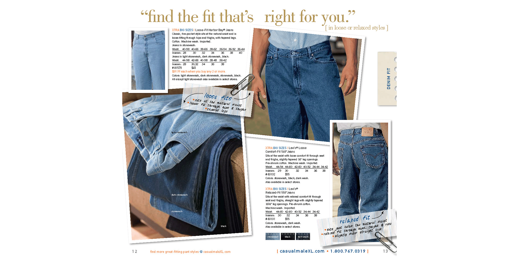
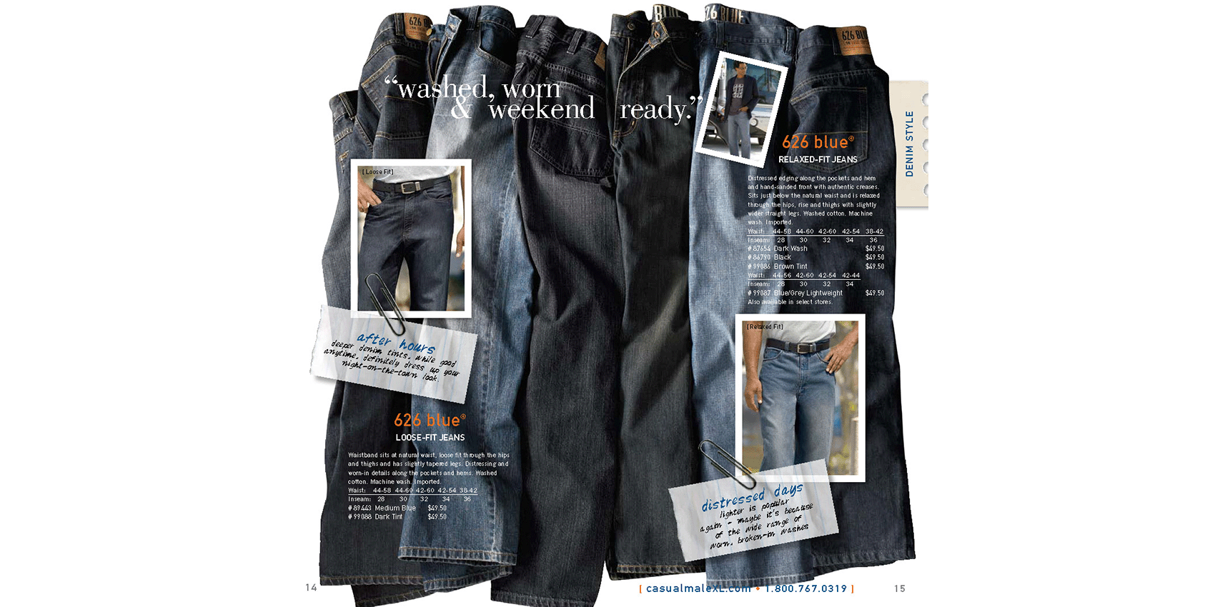
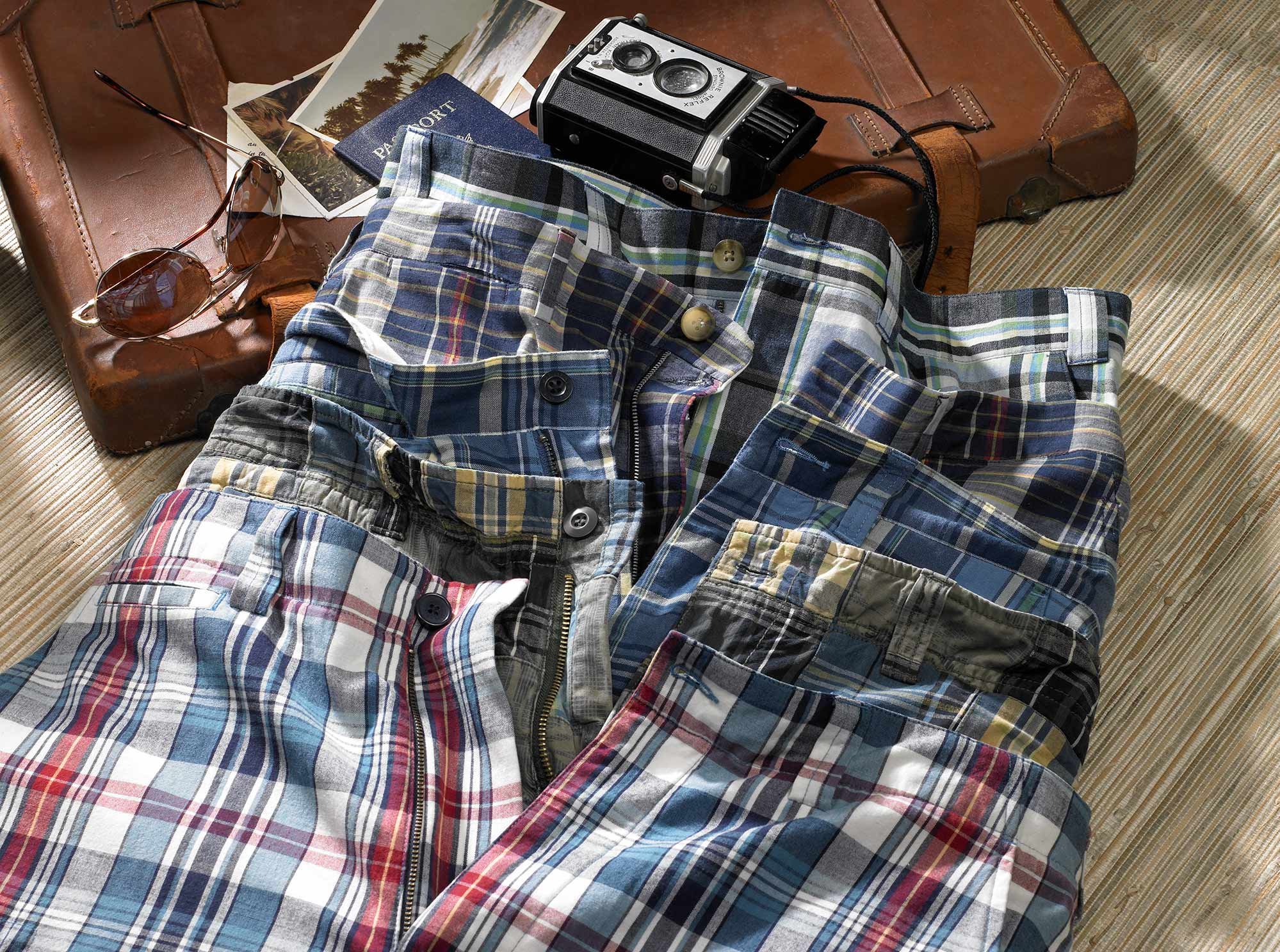
Pants Guide
The Pants Guide was a special project designed with two main goals: to help customers understand how to find a pant that fits properly and to guide them through a wide assortment of styles to find the right option. Shopping for pants can be a frustrating and often discouraging experience for many men, especially those who are big and tall. With so many styles, brands, and unique features to consider, the guide aimed to streamline and simplify the shopping process, making it more accessible, efficient, and ultimately more satisfying for the customer.